Charts
Charts help people understand data quickly. Whether one wants to make a
comparison, show a relationship or highlight a trend, they help the
audience or even yourself to “see” what actually happens. Each of our 11
chart types has different features that make them better suited for
specific tasks.
To create a Chart select the cell/range with the Data to be displayed
and click in the top bar on the Insert Chart Icon. Choose the Chart type
and create the chart by clicking on the canvas. There are two ways to
adjust the chart settings. You can either directly adjust the chart
functions or use the Chart Wizard. There are many different settings to
play with: add a title, tooltipps and a legend, determine the length of
the axis, allow zooming or use different colors for e.g. the columns or
even the grid lines etc.. The best would be to try it out yourself 😄.
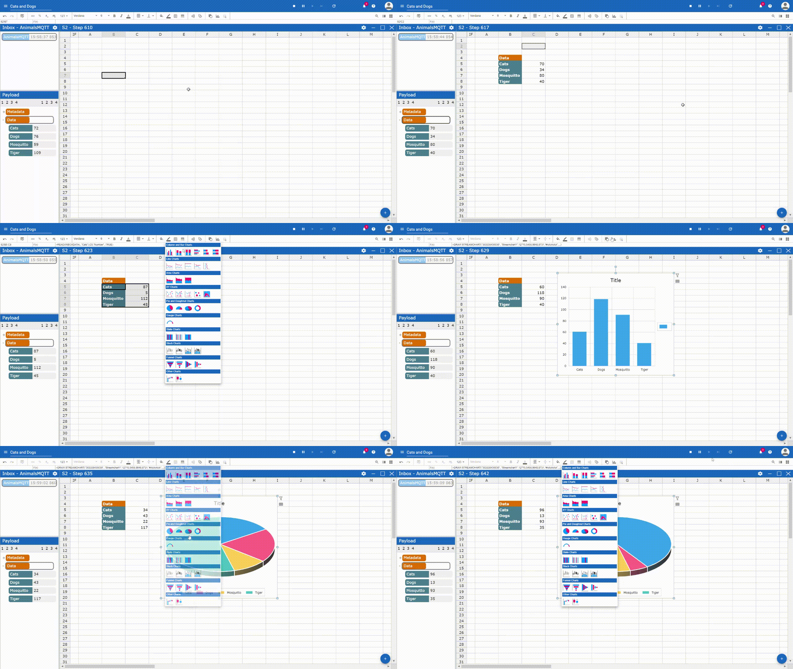
Creating a chart
Chart Wizard
There are two ways to adjust Charts in Streamsheets. One way is to simply select the parts of the Chart, which you want to change and edit the formular, which is displayed in the edit field and/or use the toolbar icons e.g. to adjust colors etc..
A more convinient way is the use of the Chart Wizard. Double click the chart you wish to adjust and the Chart Wizard will appear.
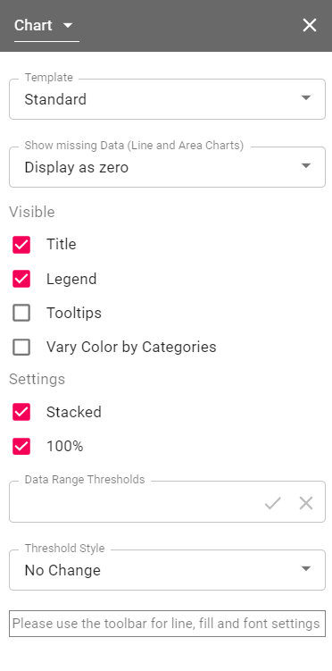
There are many ways a chart can be individually adjusted. This also depends on the kind of chart you are using. Different charts different options. In general, the chart wizard consists out of the following categories:
- Chart: define general settings
- Plot: define what the data source is and how to interprete it.
- Title: define title position. Change title in edit field and title format over toolbar.
- Legend: define legend position. Change legend format in toolbar.
- Series: define series settings. (multiple series possible)
- Axis: set X&Y axis settings like zooming and position. Add other axis, if needed.
- Grid: show or hide grid for X&Y axis. Change format with toolbar.
- Data Point: only accessible over mouseclick. Select singular data point. Change appearance.
Chart Types
The Chart Type you choose depends on what kind of information you want to present. Displaying the current machine temperature requires a different chart than showing the relationship between the temperature and time. It depends on how many variables need to be shown.
If there is just one variable your perfectly fine using Line, Cloumn, Bar, Pie, Dounghnut, Area , Polar Area or Radar Charts. To show the relationship between two different variables we recommend Line (X/Y) or Scatter. A bubble chart is similar to a scatter plot, but you even can introduce a third variable. For more specific use cases there are State, Stock and Funnel Charts.
Depending on your selected data range, you will get a dynamic or a static chart (updating references or fix data input).
Area Chart
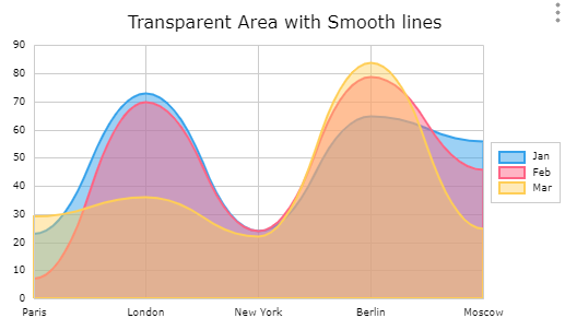

The Area Chart is similar to a line graph. Area charts are different from line graphs, however, because the area between the x axis and the line is filled in with color or shading. Area charts are a good choice to use when you want to show a trend over time, but aren't as concerned with showing exact values. At least one data series is needed.
Boxplot Chart
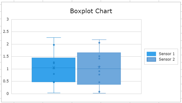
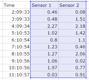
The Boxplot Chart can be used to graphically visualize the median,
minimum, maximum and quartiels of a data set.
Column & Bar Chart
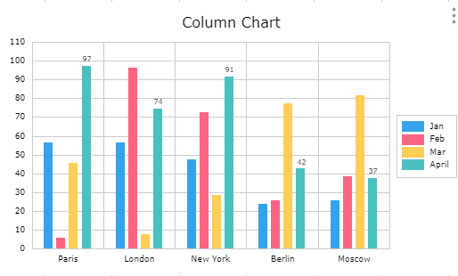
Column & Bar Charts are used to show differences between diferent data series categories. The height or length of a column/bar visualizes the value of a category. At least one data series is needed.
Combination Chart
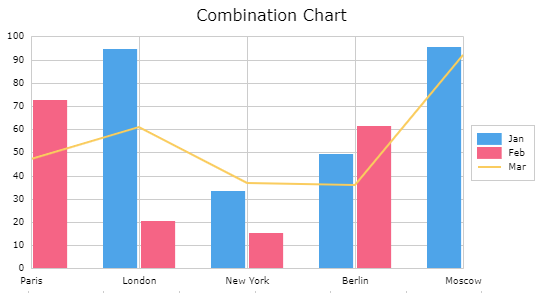
It is possible to combine column, area and line representation of a data series in one chart. Create one of the mentioned charts in the above described way and select a single data series. In the Chart Wizard you are now able to select the form of representation for the series.
Funnel Chart
Funnel Charts are often used for visualizing linear processes with
connected stages.
Gauge Chart
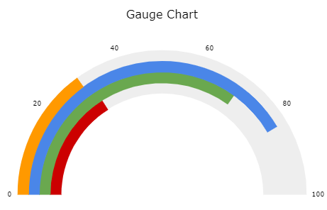
Also known as a speedometer chart or a dial chart, a gauge chart is one of the most commonly used visual tools to represent progressive values. This chart type is often used in executive dashboard reports to show key business indicators. Gauge charts are useful for comparing values between a small number of variables either by using multiple needles on the same gauge or by using multiple gauges. Gauge charts in Streamsheets come with different visual options. Switch between pointer and bar indicator, colorfull indicate certain value categories and adjust the gauge presentation in degrees.
Heatmap Chart
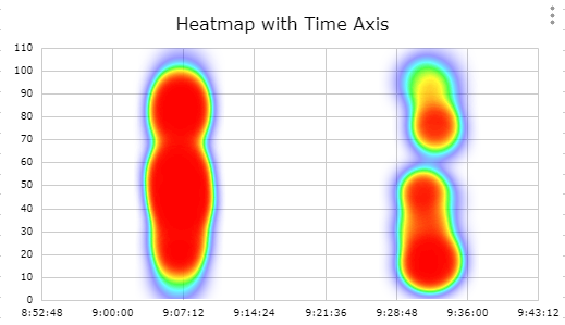
The Heatmap Chart visulizes intensity of points on a XY Chart. The closer together the hotter (red) the map gets. In this example picture we used timeseries functions for the data range. Click here if you want to know more about timeseries functions.
Line Chart
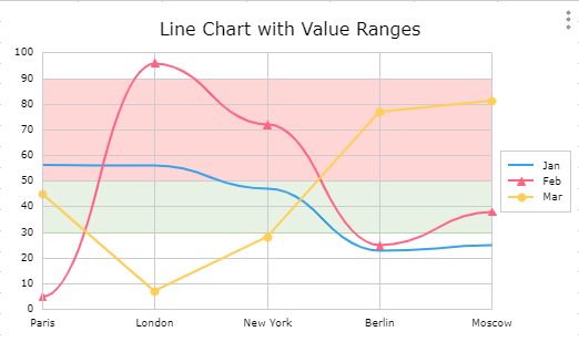

Line Charts are often used to describe values measured over time. But careful: They only connect datapoints over categories, so the distance between the categories does not claim to be accurate. This can be done via the X/Y Chart.
Pie & Doughnut Chart
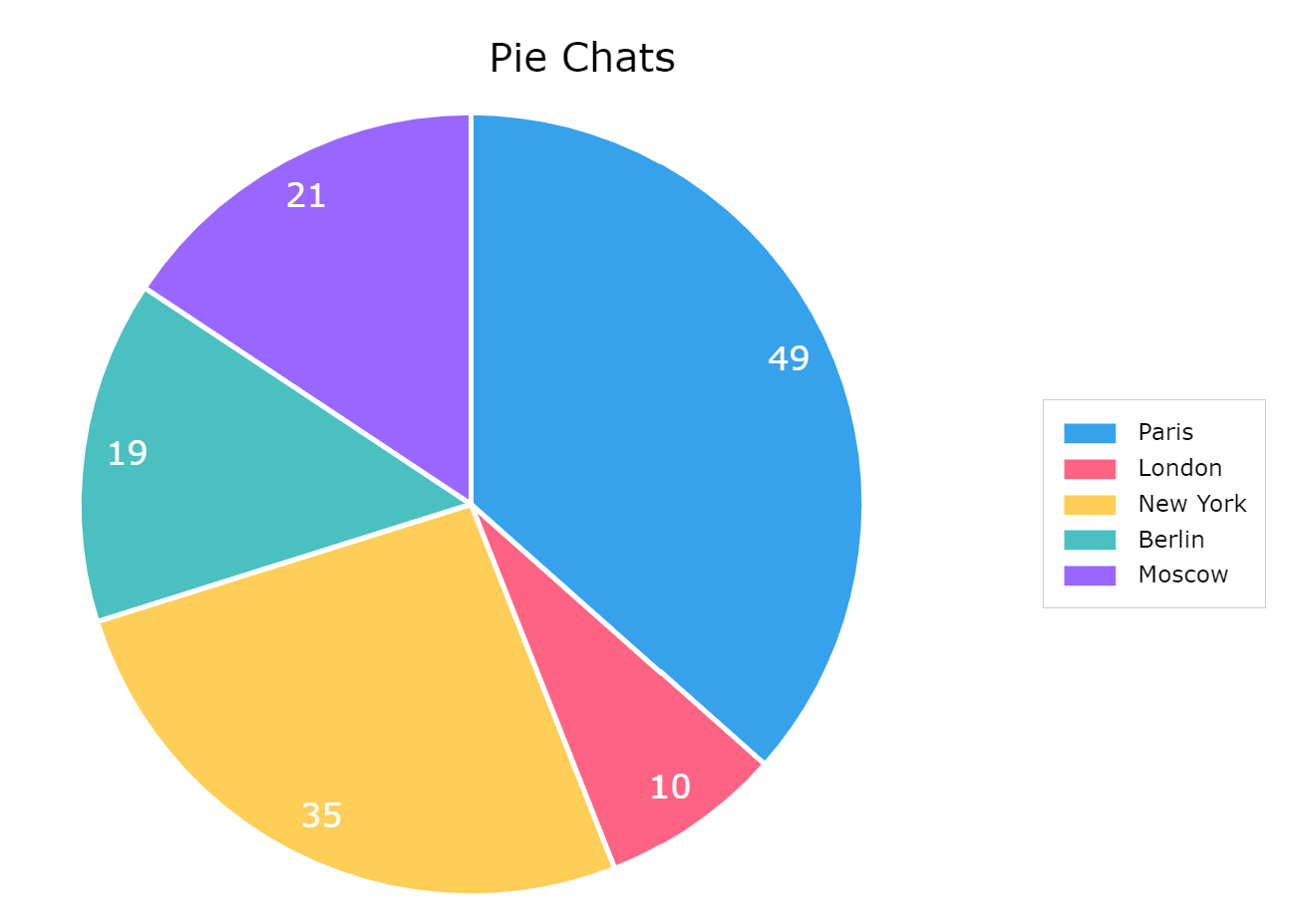

Pie & Doughnut Charts help to visualize parts of a whole and their respective size. Each segment of the pie represents its size in comparison to the other segments. One data series is needed.
State Chart
State Charts visualize differnt states. Each state has a dedicated
color. To display a state chart create three columns of data consisting
of X axis, values and colors. Depening on the State Chart type the X
axis values use either categorie or timeseries data. To further use the
information the values provide, uncheck the "100%" checkbox in the chart
wizard. The size of the columne now represents the value. Using ";" in
the color column you can add line color and a specified datalable text.
To see the text activate datalable and the "state" checkbox in the chart
wizard.
State Chart Category:
Indicates different states of different categories.
State Chart Time:
Indicates states at certain time points.
State Chart Periode:
Indicates states over a time periode. From time point a to b.
Stock/Candelstick Chart
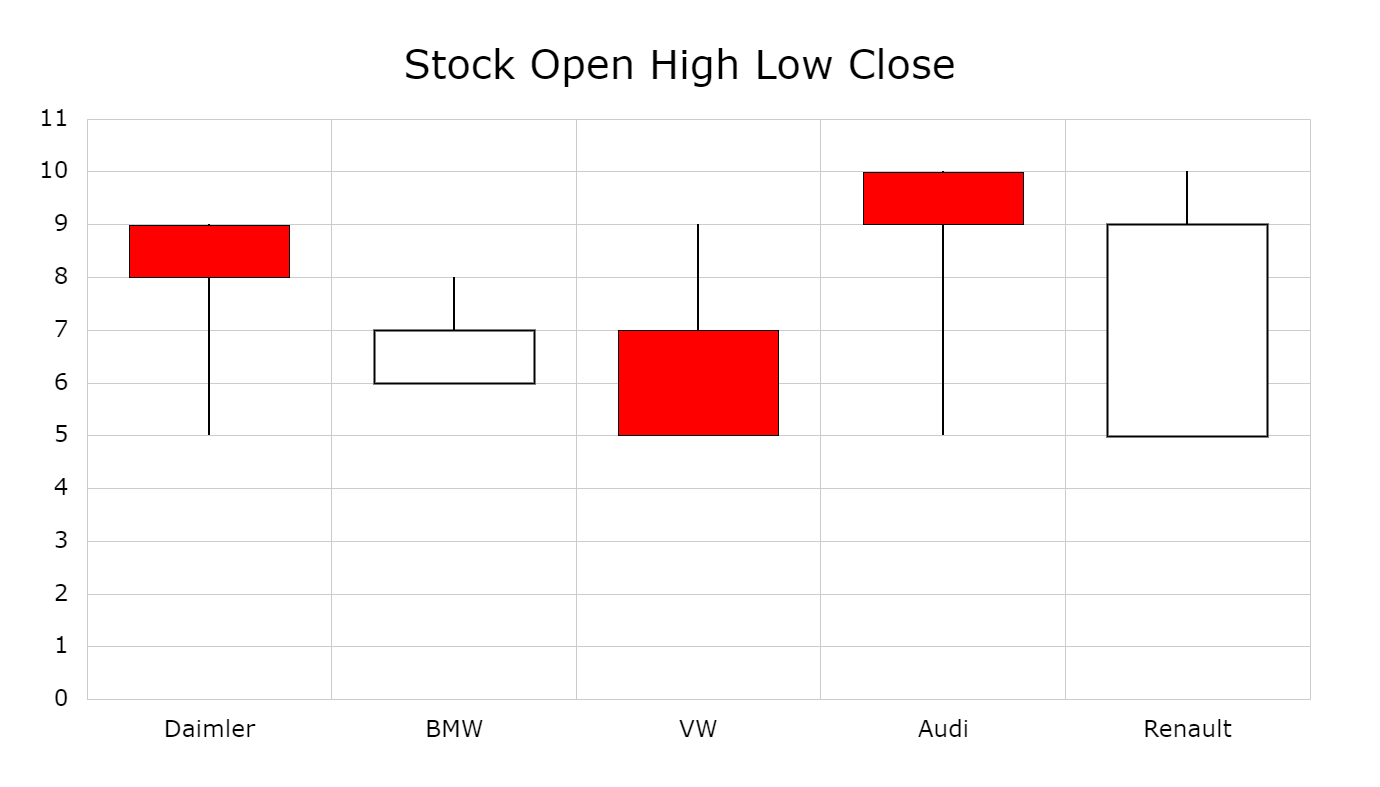
The Candelstick/Stock Chart are a style of financial chart used to describe price movements of a security, derivative, or currency. Each "candlestick" typically shows one day, thus a one-month chart may show the 20 trading days as 20 candlesticks. Candlestick charts can also be built using intervals shorter or longer than one day. It is similar to a bar chart in that each candlestick represents all four important pieces of information for that day: open and close in the thick body; high and low in the “candle wick”.
Being densely packed with information, it
tends to represent trading patterns over short periods of time, often a
few days or a few trading sessions. Depending on the selected version of
the Stock chart one either needs three, four or five data series.
Waterfall Chart
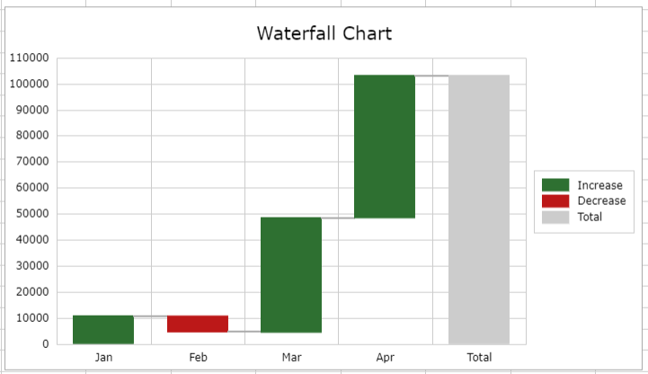

The Waterfall Chart displays processes and their changes over set
categories looking for increases, decreases, with the possibility of
adding the sum.
XY Chart
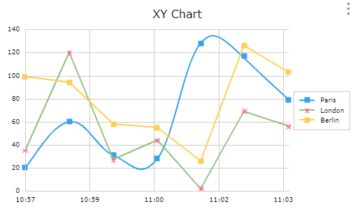
The XY Chart shows the relationship of data sets. In many use cases it is used for time series data, to show accurate time/value relations.
Data Source
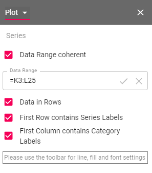
Every chart needs a data source to be able to display data. The most known practice is to use a data range. As seen in the "chart type" section, the ranges differ from type to type. Check out the examples above to get a better idea. To change the interpretation of the given range, or to allow not coherent data ranges, select the chart wizard and navigate to "Plot".
Besides using data ranges, the XY chart offers another option for data sources. Functions. Some functions hold data in their cell. These can either be timeseries functions or query functions TIME.AGGREGATE; (TIMESCALE.SELECT; ...). Use a cell reference on one of these functions and you are able to create XY charts without creating huge data tables on your Streamsheet.
Check out our tutorial for more information.