Create Dashboards
There are multiple tools and elements in Eclipse Streamsheets to help you build your apps into a fully functional dashboard. Compose your own UI out of different shapes, interactive elements and charts.
Dashboard Sheet
The dashboard sheet is an alternative sheet version, which does not work with cells, but uses a matrix grid to order shapes, charts and interactive elements to build a full-blown dashboard.
Add a dashboard sheet, by hovering the plus icon in the bottom right corner and click the dashboard sheet icon. Per application, only one dashboard sheet is allowed.
The image shows the first setup of the dashboard sheet. A 2x2 matrix. Every element in the matrix is clickable. To navigate between different hierarchies, keep clicking the same spot. A double click opens the “properties” menu (or right click “edit properties”).
Dashboard settings
Before starting to design the dashboard, it makes sense to define the alignment and resizing behavior on different screen sizes. Open a new dashboard. Click once in a tile. Shortly wait. Click once more into the same tile. Now the full dashboard should be selected (see (1) on screenshot). Right click and select "Edit properties ...". The properties' menu on the right appears ((2) on screenshot)
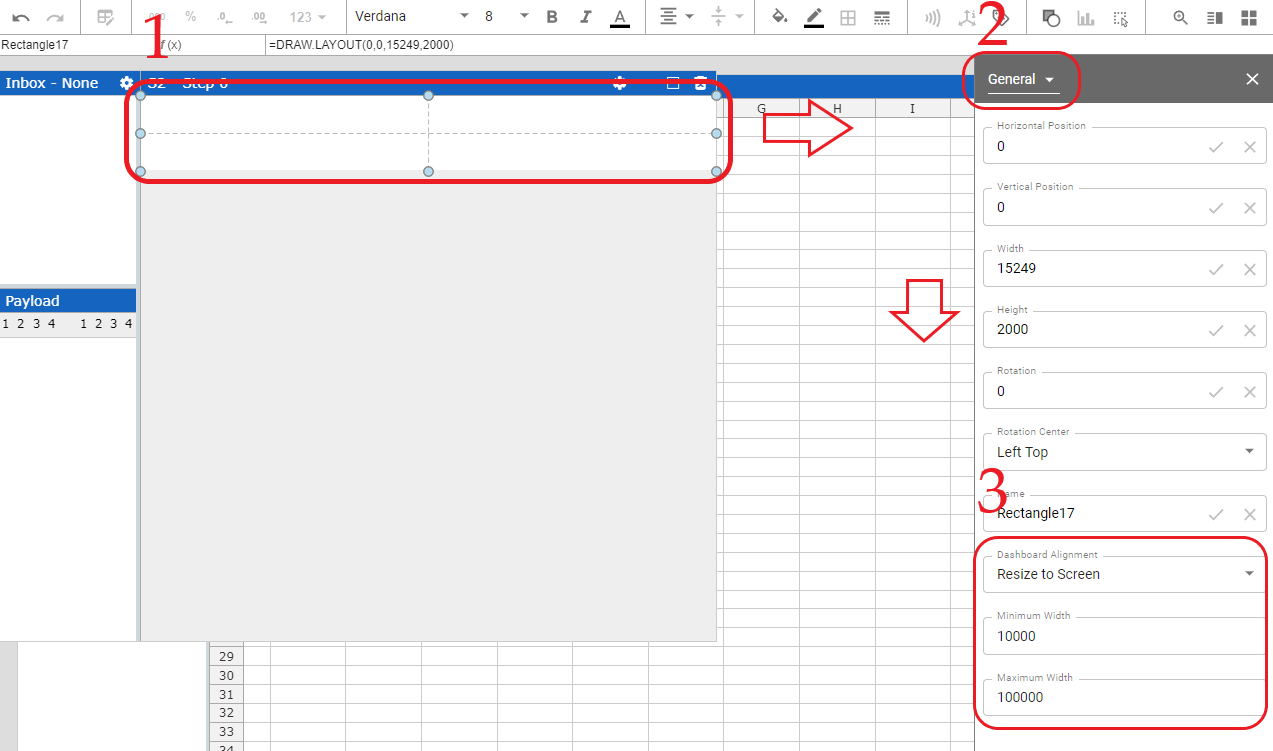
On the tab "General" you can set in the lowest three cells how the dashboard behaves on different screen sizes.
- “Resize to screen” automatically adjust the dashboard size and is located in the center of the screen.
- With the setting “Center” the dashboard has always a fixed size and is placed in the middle of the screen
- “Left align” has a fixed size and is placed on the left of the screen
The "Resize to screen" mode, is able to use a "Minimum" and "Maximum Width" parameter to define max and min sizes for the dashboard, while resizing (see (3) on screenshot).
Matrix Cell
A single rectangle in the dashboard is called a matrix cell and has different layout options.
- Row Layout: automatically sizes elements within the cell boarder
- None: No automatic lay outing. A matrix cell behaves as a canvas.
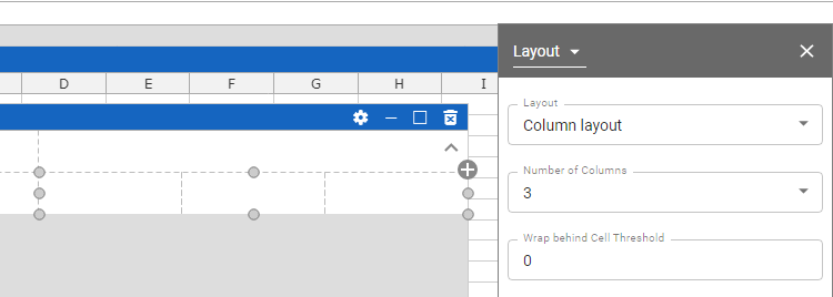
- Column layout: Divide matrix cells in further sub cells. Choose between 2 and 10 sub columns per matrix cell.
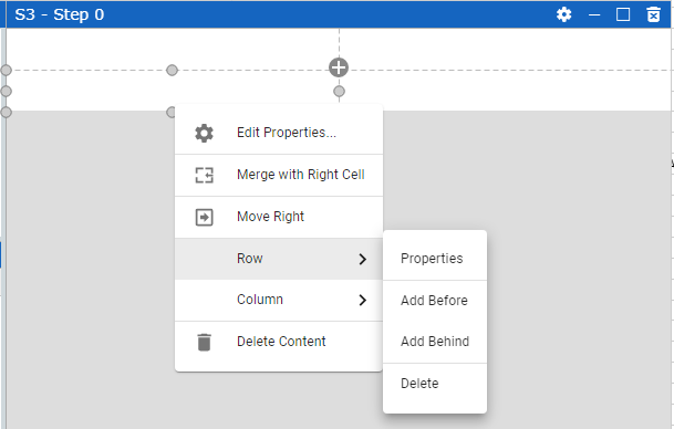
You are able to add further rows and columns to the matrix by right clicking a matrix cell.
Structure:
While building a dashboard, it is common to work with different structured rows. One row may need two matrix cells, another four. To add more matrix cells within a row, start adding further columns. Merge cells in rows, where you need less matrix cells.
The structure of the matrix cells, is linked to each other over all rows and columns. If you are in the need of breaking out of this structure, use the “Column layout” feature of a cell. The “Column layout” divides one matrix cell into multiple sub cells, which act independent of the above matrix. You are able to set the width of these cells without changing the layout of other rows.
Size:
You are only able to adjust the width of a cell, if your dashboard settings are either on “center” or “left align”. (“Resize to Screen” always adjusts the size automatically.) What you are able to do is change the relative size of the cells to each other.
The height of a matrix cell on default adjusts automatically to the size of the elements you are inserting. It may be important to set a minimal height for a row. As soon as a row is empty, that is the size the “automatic” setting will size to. This is important in cases, where you use the “expandable” option of a row or dynamically hide/show elements.
You can change the row properties from “Automatic” to “Variable” to adjust the height yourself.
To open the row properties right-click a matrix cell, navigate to row and choose “Properties”.

Content
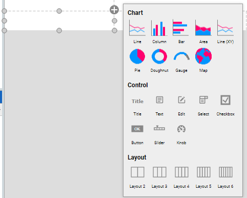
Adding content to individual cells is the main target of dashboard creation process. Either add elements via the shape or the chart tool in the toolbar, or use the “+” icon, which appears in the corner of a matrix cell after selection. The menu behind the icon offers “Chart”, “Control” and “Layout” options.
- Chart: Add charts to a cell
- Control: Add control elements. Add text elements, input fields for user, selector elements, checkboxes and more.
- Layout: Change a matrix cell layout to a “Column Layout” and add sub cells.
Charts
Charts are already covered in this section.
Shapes
In some scenarios it is necessary, to not only control data streams and implement certain logics, but create dashboards to present the data to an end user. Dashboards are popular visual displays of data, mostly comprising charts / graphs with striking attention seeking components. If you want to learn more about how to setup Charts in Streamsheets click here. In this tutorial we cover another very useful tool Streamsheets offers, which is adding shapes. Shapes can be found next to the Chart icon in the App toolbar.
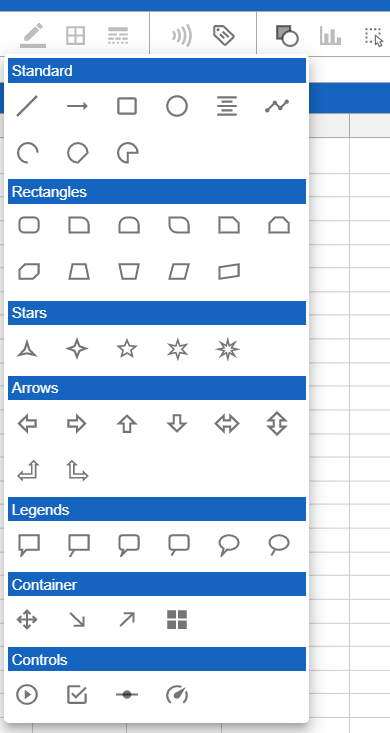
There are a ton of different shapes, which can be colored and sized the way you want. As everything else in Streamsheets, Shapes use functions as a base. A function can be used to add dynamic settings. For example, it is possible to dynamically set the size, coordinates or color, just by referencing cells from a sheet. All shapes have a very similar function structure:
=DRAW.RECTANGLE(X, Y, Width, Height, LineColor, FIllColor, Angle)
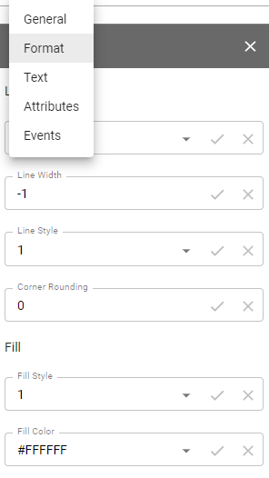
Further options can be found in the shape properties menu. To access the menu, right click a shape and select "Edit properties" or double click a shape. As with usual functions, it is possible to use cell references (=A1) in the menu parameter instead of using static input. This way you are e.g. able to dynamically hide and show a shape as you wish ("attributes" submenu, "visible" parameter).
Used references in shapes can be lost. When user interaction changes parameter, which have been illed by a reference, the reference is lost and a static parameter is entered again (e.g. moving an object, with a reference for x/y values).
One important distinction between shapes is that only lable are able to display information as they have a "Text" parameter. Lable can be created over the shape menu or via the right click menu of a shape.
Interactions
If your use case does require direct user input, there are multiple ways to allow these in Streamsheets. Before we dive into details, here a short reminder:
Always hide your logic from the end user. They will likely get confused and/or change it.
Only display the Streamsheet you want the end user to see. Open the App Settings and select it in the “Maximize Sheet on load” field
Only share your App with end user over an URL that prohibits them from changing your logic.
Interactions only work in a running app. So your workflow while creating interactions should be "edit/create" in pause or stop and "try out" in play mode. There are multiple ways you can allow an end user to adjust the visualization of your dashboard.
SELECT()
A very fast and easy way to allow user interaction is the SELECT() function. It allows the end user to select a value from a list of options. This selection then can be integrated in your sheet logic.

Example use case: A dashboard is created to gather information on different month of. The user is allowed to select from a list of month to trigger a certain interaction. Depending on which month is selected, the represented information change.
Interactive Shapes
In the shape menu, in the controls category, you can find interactive elements. In a stopped or paused app, these elements can be adjusted as usual, by selecting the shape and changing the formula parameter. In a running app "control" shapes become interactive and are not selectable anymore.
Checkboxes are very helpful in use cases, where switching between two states is necessary. They switch their value parameter depending on the user interaction to FALSE or TRUE. To work with these states use a cell reference in the value parameter. Now you only have to use the referenced cell in your sheet logic to react on state changes.
*Example use case: You want to only show certain information, when a check box is selected. FALSE represents that the information will not be shown. If the information you would like to hide is represented in an e.g. rectangle shape you could use the attributes menu of the DRAW.RECTANGLE function to switch between visible and not visible.
Slider allow the selection of values between a given minimum and maximum. Again referencing the value parameter to a cell gives you the power to integrate the selected value into your sheet logic.
Example use case: An End User should be able to regulate a thermostat between the values of 15°C and 25°C. With the slider the user sets the wished temperature and the value gets set in the referenced cell of the value parameter. The value will be then published to the thermostat over e.g. an MQTT Stream. Now the user directly impacts the temperature by moving the slider.
The Knob works exactly like the slider, but instead of sliding from left to right the end user animation is turning a knob.
Button, like the checkboxes, set TRUE or FALSE values. The difference is, that they only set the value parameter to TRUE, as long as the user is pressing the button. After the release, the value turns back to FALSE. Again using a cell reference for the value parameter is the key to integrate the interaction in your sheet logic. Tip: Try to use EDGE.DETECT() if you only need a one time switch to TRUE.
Example use case: An end user should be able to open a valve by pushing a button on the screen. The valve only knows two states “open” and “close” and is connected to a MQTT broker. The payload of the message will now change dynamically and depending on the state of the button either “open” or “close” will be published.
EVENTS
Events add another layer to end user interactions. The event menu is located within the shape properties (to open double click shape). Possible Events are:
- ONMOUSDOWN
- ONMOUSEUP
- ONCLICK
- ONDOUBLECLICK
Integrating one or more events in the EVENT() function, adds the
possibility to define actions. For example adding
COPYVALUES(A1:B11,G10:H10) to the onclick parameter triggers the COPYVALUES
function after an onclick action by the user.
Other functions which could be used in this context:
- MQTT.PUBLISH (or any other stream function)
- SETVALUE
- CLEARCELLS
- DELETECELLS
- COPYVALUES
- DELETE
- EXECUTE
- FEEDINBOX
- STACKADD (or any other stack function)
- WRITE
- SHOWVALUES
- SHOWDIALOG
- OPEN.URL
Images
It is possible to add images to your Streamsheet.
Every object has different fill styles. Create an object and open the format menu of the "Object Properties".
Fill style three correspondes to images. You are able to set up images as the fill input. You are also able to connect the fill input directly to the sheet by using a reference. =A1
Drag & Drop
Add images, by dropping them on the sheet of your choice.The maximum amount of pixel for an image is 250.000 (e.g. 500*500px). Simply drop an image on a sheet to add it. This automatically creates a DRAW.RECTANGLE() function containing your image file. Check the properties menu. The drag and drop interaction automatically converted your image into e.g.: `dataimaged1db85a8-4445-4126-9377-9dc74aa36d74.
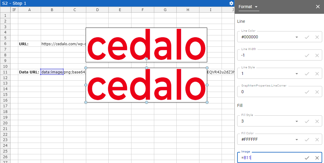
URL & Data URL Images
You can also load your images into Streamsheets by using (Data)URLs. This makes sense, if you dynamically want to change pictures. Get a new (Data)URL in your sheet and display it directly.
URL Syntax: Has to be a direct link to an image e.g.: https://cedalo.com/wp-content/uploads/2021/05/cropped-Cedalo-red-logo-1.png
Data URL Syntax: Has to be base64 encoded. Use the following prefix: data:image/jpeg;base64, ("jpeg" can also be a different file format) & add the base64 values behind the comma.