Building a Dashboard
There are multiple tools and elements in Eclipse Streamsheets to help you build your apps into a fully functional dashboard. Compose your own UI out of different shapes, interactive elements and charts.
Dashboard Sheet
The dashboard sheet is an alternative sheet version, which does not work with cells, but uses a matrix grid to order shapes, charts and interactive elements to build a full-blown dashboard.
Add a dashboard sheet, by hovering the plus icon in the bottom left corner and click the dashboard sheet icon. Per application, only one dashboard sheet is allowed.
The image shows the first setup of the dashboard sheet. A 2x2 matrix. Every element in the matrix is clickable. To navigate between different hierarchies, keep clicking the same spot. A double click opens the “properties” menu (or right click “edit properties”).
Dashboard settings
Before starting to design the dashboard, it makes sense to define the alignment and resizing behavior on different screen sizes. Open a new dashboard and either double-click it, or use the mouse right-click to access the settings. The settings always display the settings of the selected item. To see the settings for the whole dashboard, make sure to have selected the full dashboard and not only a tile.
On the tab "Dashboard" you can set in the lowest three cells how the dashboard behaves on different screen sizes.
- “Resize to screen” automatically adjust the dashboard size and is located in the center of the screen.
- With the setting “Center” the dashboard has always a fixed size and is placed in the middle of the screen
- “Left align” has a fixed size and is placed on the left of the screen
The "Resize to screen" mode, is able to use a "Minimum" and "Maximum Width" parameter to define max and min sizes for the dashboard, while resizing (see (3) on screenshot).
Matrix Cell
A single rectangle in the dashboard is called a matrix cell and has different layout options.
- Row Layout: automatically sizes elements within the cell border
- None: No automatic lay outing. A matrix cell behaves as a canvas.
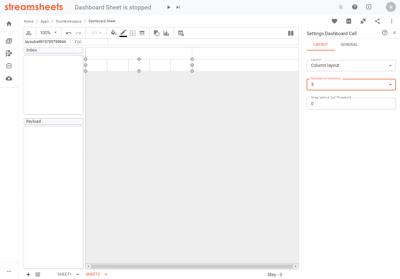
- Column layout: Divide matrix cells in further sub cells. Choose between 2 and 10 sub columns per matrix cell.
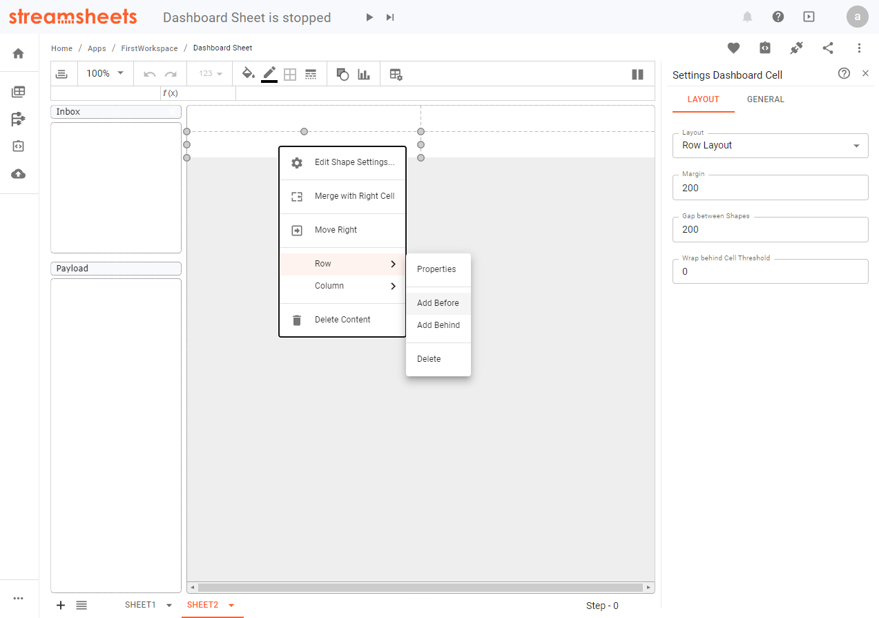
You are able to add further rows and columns to the matrix via the context menu by right-clicking a matrix cell.
Structure:
While building a dashboard, it is common to work with different structured rows. One row may need two matrix cells, another four. To add more matrix cells within a row, start adding further columns. Merge cells in rows, where you need less matrix cells.
The structure of the matrix cells, is linked to each other over all rows and columns. If you are in the need of breaking out of this structure, use the “Column layout” feature of a cell. The “Column layout” divides one matrix cell into multiple sub cells, which act independent of the above matrix. You are able to set the width of these cells without changing the layout of other rows.
Size:
You are only able to adjust the width of a cell, if your dashboard settings are either on “center” or “left align”. ( “Resize to Screen” always adjusts the size automatically.) What you are able to do is change the relative size of the cells to each other.
The height of a matrix cell on default adjusts automatically to the size of the elements you are inserting. It may be important to set a minimal height for a row. As soon as a row is empty, that is the size the “automatic” setting will size to. This is important in cases, where you use the “expandable” option of a row or dynamically hide/show elements.
You can change the row properties from “Automatic” to “Variable” to adjust the height yourself.
To open the row properties right-click a matrix cell, navigate to row and choose “Properties”.
Content
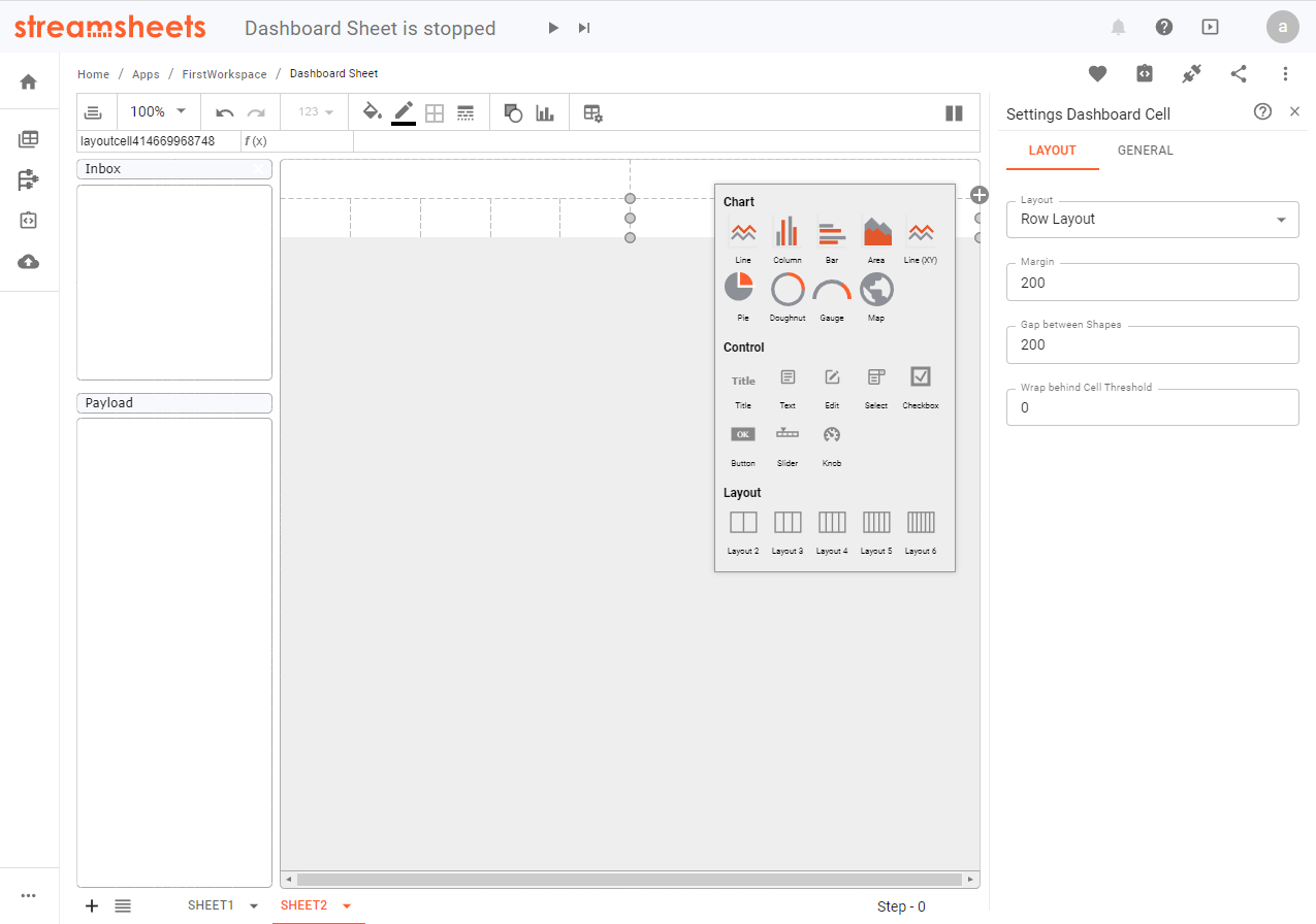
Adding content to individual cells is the main target of dashboard creation process. Either add elements via the shape or the chart tool in the toolbar, or use the “+” icon, which appears in the corner of a matrix cell after selection. The menu behind the icon offers “Chart”, “Control” and “Layout” options.
- Chart: Add charts to a cell
- Control: Add control elements. Add text elements, input fields for user, selector elements, checkboxes and more.
- Layout: Change a matrix cell layout to a “Column Layout” and add sub cells.