Shape Settings
A shape's appearance can be influenced via your mouse or the toolbar. If that is not enough, further settings are located in the Shape Settings. To open, either double-click the shape or use the right-click context menu. Depending on the shape type a tab at the top offers specific shape settings, like for a chart you have a tab for chart settings. All shapes have the "General" tab with common settings for all shapes, which are explained here.
Most of the attributes of shape can alternatively be configured by using a formula. If an edit field is used to change the attribute, simply enter a cell reference to link to the source value of the attribute. E.g. if you want the width of a shape to be dependent of cell "A1", you just have to enter =A1 in the width edit field. From now on the width of the shape adapts to the value of Cell "A1". But be aware that shapes are also part of the recalculation logic and are also only updated, when the app runs.
Some attributes do not have edit fields, but a checkbox or color or list selector. For those, a function button is available next to the attribute editor. Clicking on that, you can enter a formula. If you delete the formula, the old editor will reappear.
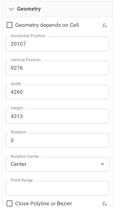
Geometry
Settings
|  |
Custom Polygon or Bezier Shapes
To define a custom polygon, you have to define a point range, that provides the relative positions of the coordinates of a polyline, polygon or bezier curve. The coordinates are defined as fractions of the size of the shape using values between 0 and 1 like in the screenshot below. The resulting points will be connected in order from top to bottom.
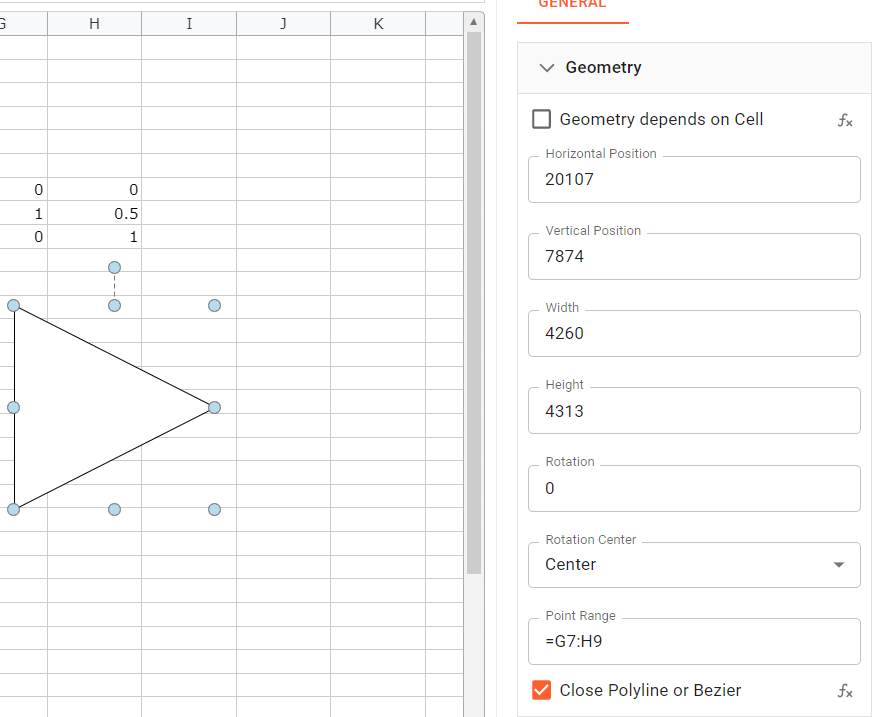
In the sample a cell range is set up to display a triangle. The range is assigned as the "Point Range". The polygon shape then is using the coordinates. As the "Close Polyline" box is checked, the polyline is closed to form a polygon.
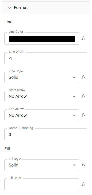
Format
The format allows for changes in the line and fills format.
A shape format offers the following attributes for lines or border formatting. The line attributes for arrows only appear, if a line or polyline is selected.
Different fill styles can be defined.
|  |
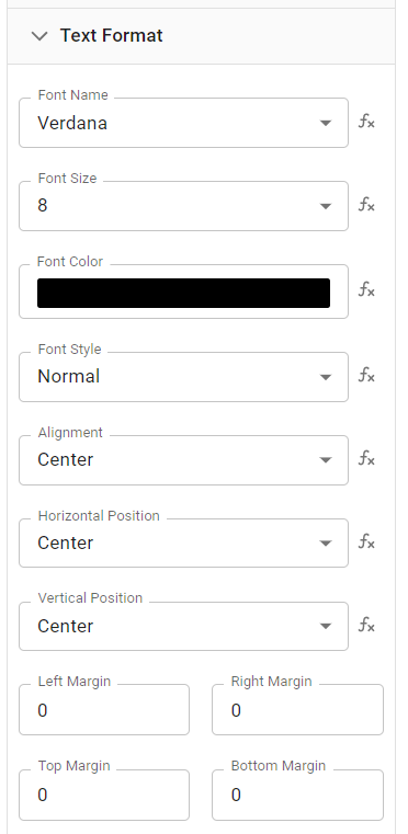
Text Format
If you apply a text format to the shape containing a text, the format will be applied to all labels within the shape.
The text format allows the adjustment of text font, color, size, style, alignment, position, and margin.
|  |
Name
Names are unique identifiers for shapes. On creation, a default name is set, which can be changed. Use the name to identify the purpose of a shape. Further, the name can be used by the DOT notation, to link shape values to a cell.
|  |
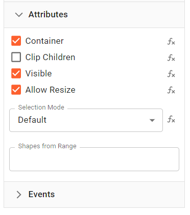
Attributes
The attributes section allows for turning on and off certain shape attributes.
|  |
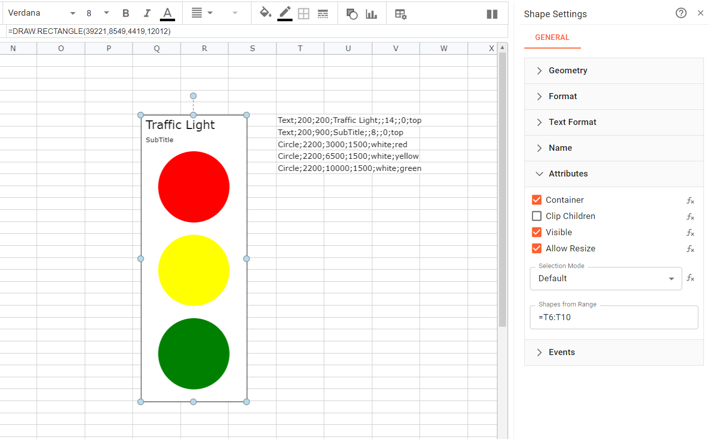
Shapes from Range
The "Shapes from Range" allow you to enter a cell range to specify additional shapes within a shape. These items are drawn with the area of the shape. The coordinates of them are relative to the shape in 1/100th mm. This way you can add custom items to the shape to visualize additional information or hints. The cell defining a shape must follow the following text representation. In general it is a string with definitions for the shape parameters divided by semicolons. The first parameter defines the type. A sample would be "Line;1;10;2;20;red" defining the type, the coordinates and the color of the line.
The following types are available:
"Line" with the following parameters
- X1 : X coordinate for the beginning of the line
- Y1 : Y coordinate for the beginning of the line
- X2 : X coordinate for the end of the line
- Y2 : Y coordinate for the end of the line
- LineColor : A valid color name of hex color value
"Circle" with the following parameters
- X : X coordinate for the center of the circle
- Y : Y coordinate for the center of the circle
- Radius : Circle radius in 1/100mm
- LineColor : A valid color name of hex color value
- FillColor : A valid color name of hex color value
"Rect" with the following parameters
- X : X coordinate for the left or center
- Y : Y coordinate for the top or center
- Width : width in 1/100mm
- Height : height in 1/100mm
- LineColor : A valid color name of hex color value
- FillColor : A valid color name of hex color value
- Center : If this flag is set to 1, the coordinates define the center of the rectangle instead of the top left position
"Text" with the following parameters
- X : X coordinate for the center
- Y : Y coordinate for the center
- Text : Text to display
- FontName : A valid font name
- FontSize : Font size in points
- FontColor : A valid color name of hex color value
- HAlign : Horizontal alignment. 0 for left, 1 for center and 2 for right alignment. Default is 1.
- VAlign : Vertical alignment. Use "top", "middle" or "bottom". Default is "middle".
A vertical range with at least one row and one column is expected.
Below a sample showing a traffic light with a title. To enhance this, the traffic light could use cell references or formulas to show the traffic light color depending on a value or state.
Events
Events add another layer to end-user interactions. If one of those event is executed on a shape, the commands of the event are executed or calculated. Event are only executed, if the app is running.
Integrating one or more events in the Events section, adds the possibility to define actions. For example adding COPYVALUES(A1:B11,G10:H10) to the OnClick event triggers the COPYVALUES function after an OnClick event is executed by a user.
You would probably use the button shape to attach events to.
|  |
Functions, which could be used in this context:
- MQTT.PUBLISH (or any other stream function)
- VALUE.SET
- CLEARCELLS
- CELL.DELETE
- VALUE.COPY
- DELETE
- EXECUTE
- FEEDINBOX
- STACK.ADD (or any other stack function)
- WRITE
- SHOWVALUES
- DIALOG.SHOW
- OPEN.URL