Interactive Shapes
In the shape menu, in the controls category, you can find interactive elements. In a stopped or paused app, these elements can be adjusted as usual, by selecting the shape and changing the settings. In a running app these shapes become interactive and are not selectable anymore. That is also the state, when their value changes after user input.
Button
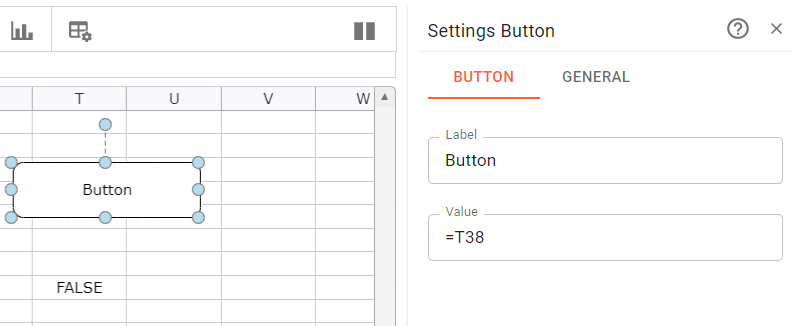
A button is used to initiate an action, after a user clicked on it. The button has two settings, the label, that is displayed within the button and the value, which represents the state of the button. A value of "TRUE" means that the button is pushed, a value of "FALSE", that it is not pushed. You can assign a cell reference to the value. This has two effects. The current state is taken from the cell, but also the state imposed by a user is pushed back to the cell.
In the sample below the button value is assigned to cell T38. If the app runs and the button is pushed, the value will change from FALSE to TRUE, as long as the mousebutton is down. After releasing it, it is set to FALSE.
You can alter the sheet logic based on the changing value. Another option is to use an event attribute to initiate an action.
Checkbox
A checkbox visualizes the state of an attribute. Here the user can activate or deactiveate the checkbox by clicking on it. In contrast to the button above the state is switch with a click, not on mouse-down/up. The two attributes of the checkboc allow to modify the label of the checkbox and to define the value (checked=TRUE, not checked=FALSE) of the checkbox. Like with the button you can exchange the value with a cell by assigning a cell reference to the value.
Slider
A slider allows the selection of values between a given minimum and maximum. Again referencing the value parameter to a cell gives you the power to integrate the selected value into your sheet logic. If the application runs, you can move the slider marker with the mouse.
A use case would be to regulate a thermostat between the values of 15°C and 25°C. With the slider the user sets the wished temperature and the value gets set in the referenced cell of the value parameter. The value will be then published to the thermostat over e.g. an MQTT Stream. Now the user directly impacts the temperature by moving the slider.
The following attributes visible below can be used to modify a slider.
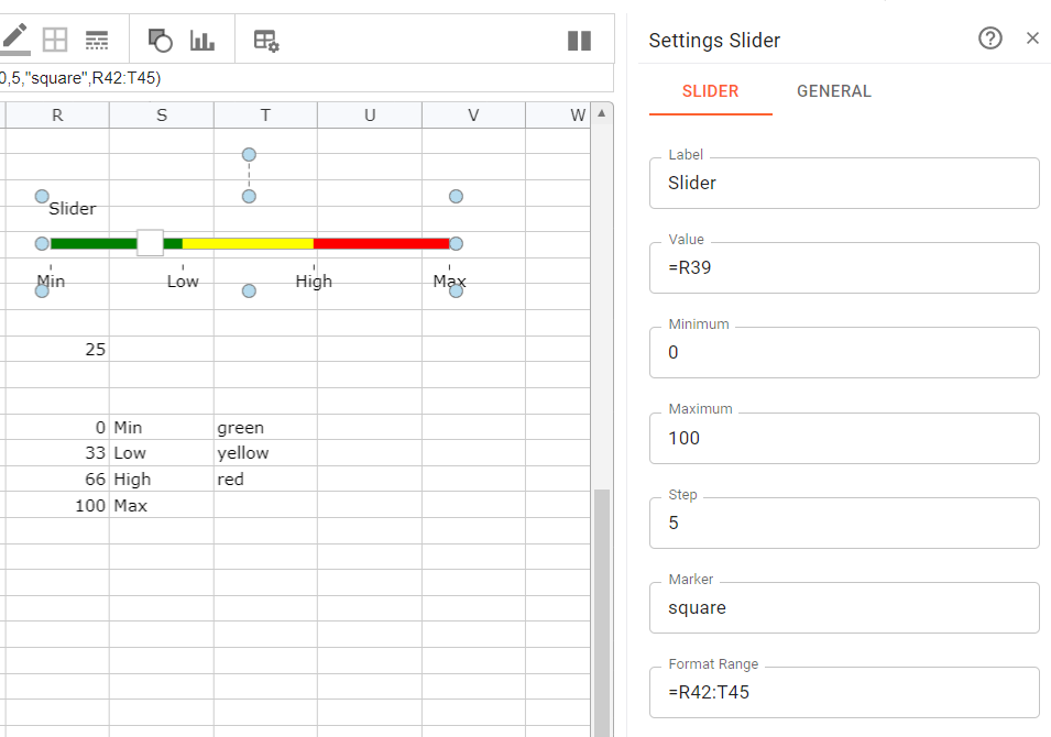
- "Label" sets the title in the top left corner
- "Value" exchanges the current value with a cell reference
- "Minimum", "Maximum" and "Step" define the limits of the slider and the increment the user is forced to use.
- "Marker" defines the appearance of the marker representing the value. The following symbol names can be assigned "square", "rect", "arrowtop", "arrowbottom", "none", "circlesmall", "circlelarge".
- "Format Range" allows to define a cell range where formatting info for the scale is defined. The idea is to color the slider background using a table formatted like in the sample above. The range consists of three columns. The first column is the start value for a color interval, the second column defines the label to show at that value and the third column the color to use until the next value of the color range, which is located below.
Knob
A knob allows the selection of values between a given minimum and maximum. Again referencing the value parameter to a cell gives you the power to integrate the selected value into your sheet logic. If the application runs, you can move the knob marker with the mouse. The knob is very similar to a slider, just a different interface to modify a value.
The following attributes visible below can be used to modify a slider.
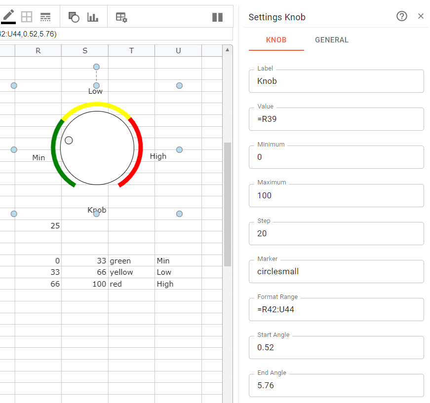
- "Label" sets the label below the knob
- "Value" exchanges the current value with a cell reference
- "Minimum", "Maximum" and "Step" define the limits of the slider and the increment the user is forced to use.
- "Marker" defines the appearance of the marker representing the value. The following symbol names can be assigned "arrowinner", "none", "circlesmall", "line".
- "Format Range" allows to define a cell range where formatting info for the scale is defined. The idea is to color the knob scale using a table formatted like in the sample above. The range consists of four columns. The first column is the start value for a color interval, the second column defines the end value for that interval, the third column defines the color to use and the fourth the label to show centered outside the range.
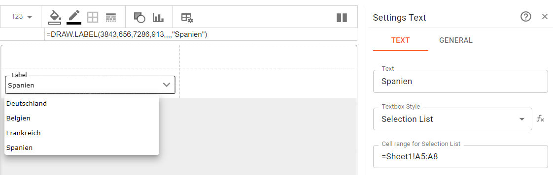
Edit or Select
This shape is only offered for dashboards. You can use it to display text or provide an input field. The view or input field can offer a list to select from. The text attribute is the value. This can also be exchanged with a cell by providing a cell reference.
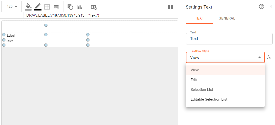
The textbox style allow you to have a view only or editable field. A selection list can also be activated. If a selection list is used, you need to provide a source range, which contains the content of the selection. This range must be provided on a sheet.