Category charts
A category chart represents a set of categories and their relating value. Below you will find a description of the available category charts and the settings to modify the general appearance of a chart type.
Where not noted otherwise we are using the below values as a data source. You can copy the data table below and paste it into the sheet.
| A | B | C | D | E | |
|---|---|---|---|---|---|
| 1 | Berlin | Paris | London | New York | |
| 2 | Jan | 41 | 97 | 29 | 20 |
| 3 | Feb | 55 | 13 | 46 | 84 |
| 4 | Mar | 48 | 95 | 90 | 37 |
| 5 | Apr | 66 | 10 | 33 | 73 |
| 6 | May | 56 | 24 | 67 | 63 |
| 7 | June | 31 | 34 | 46 | 22 |
Column Chart
Column Charts use vertical rectangular bars to show differences between different data categories. The height of a column visualizes the value of a category. At least one data series is needed.

Modifying Chart Settings a column chart can also be stacked or summed up to 100%.


Bar Chart
Bar Charts use horizontal rectangular bars to show differences between different data categories. The width of a bar visualizes the value of a category. At least one data series is needed.

Modifying Chart Settings a bar chart can also be stacked or summed up to 100%.
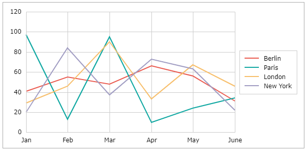
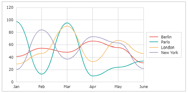
Line Chart
Line Charts are often used to describe values measured over time showing the development of a measure. As the time is given by categories the distance between the categories is not scaled relating to the ellapsed time. This can be done via the X/Y chart. Below a sample of a line chart.
Modifying Chart Settings a line chart can be stacked (showing accumulated values) or formatted to 100% (showing the relative part of a value to the sum of the values).

You can also display the changes between categories as steps using the Chart Settings or use smooth lines modifying Series Settings.
Profile Chart
Profile Charts can be used to visualize metrics for categories. A profile chart looks like a line chart, except that the categories are displayed vertically and the values horizontally.
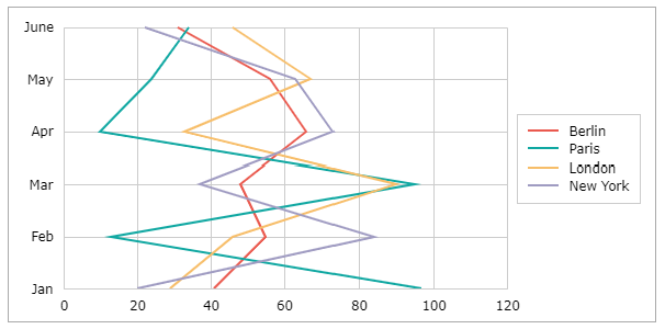
Modifying Chart Settings a profle chart can also be stacked, summed up to 100% and displayed with smooth lines modifying Series Settings.
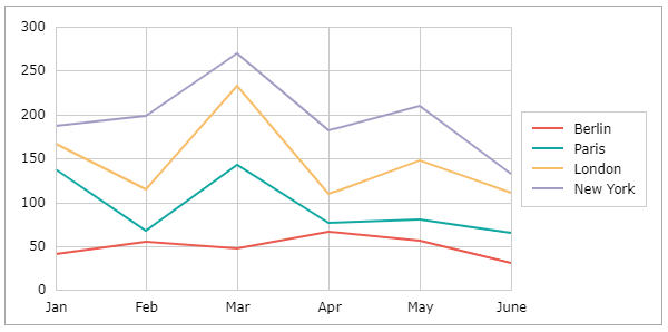
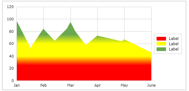
Area Chart
The Area Chart is similar to a line graph. Area charts are different from line graphs, however, because the area between the x-axis and the line is filled in with color or shading. Area charts are a good choice to use when you want to show a trend over time but aren't as concerned with showing exact values. At least one data series is needed.
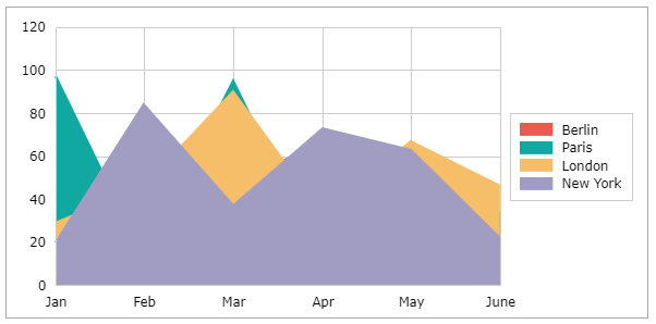
Modifying Chart Settings an area chart can also be stacked or summed up to 100%.
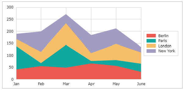
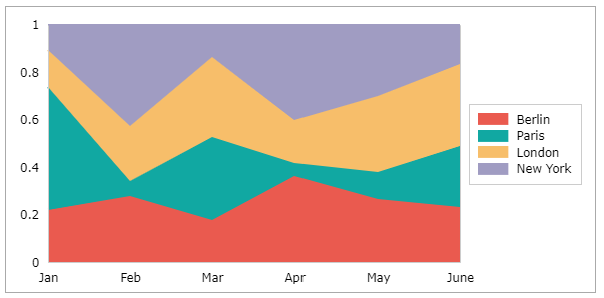
Adding Value Ranges in Chart Settings an area chart can be colored based on values.
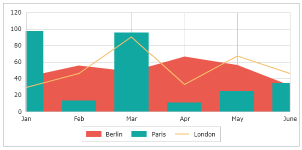
Combination Chart
It is possible to combine column, area, and line representations of a data series in one chart. Create one of the mentioned charts in an above-described way and select a single data series. Modifying Series Settings you can assign a chart type to a series.
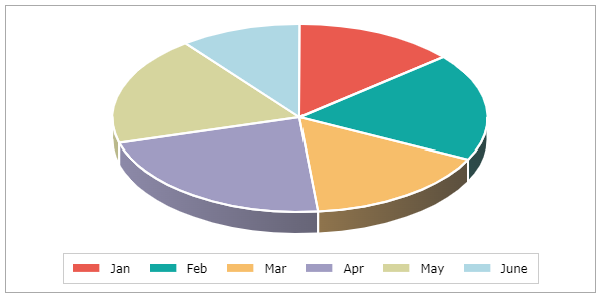
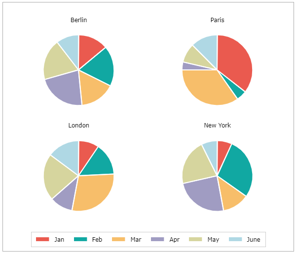
Pie Chart
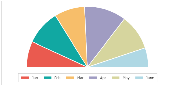
Pie help to visualize parts of a whole and their respective size. Each segment of the pie represents its size in comparison to the other segments. One data series is needed. Modifying the angles within Chart Settings the pie can be visualized with a perspective.
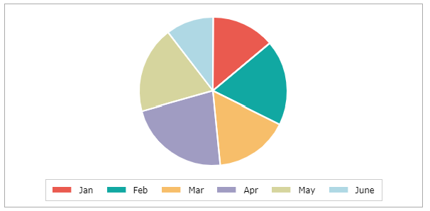
If more than one data row is within the source range, multiple pies are visualized.
Modifying Chart Settings the overall pie can be reduced to a segment.
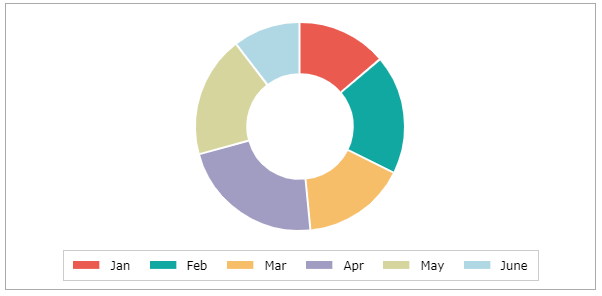
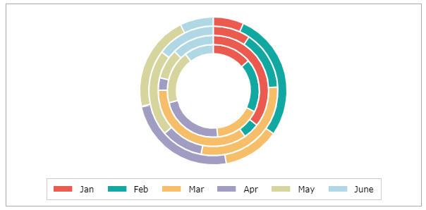
Doughnut Chart
Doughnut help to visualize parts of a whole and their respective size. Each segment of the doughnut represents its size in comparison to the other segments. In contrast to a pie, a sizeable hole is displayed in the middle of the circle. One data series is needed.
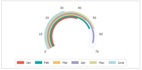
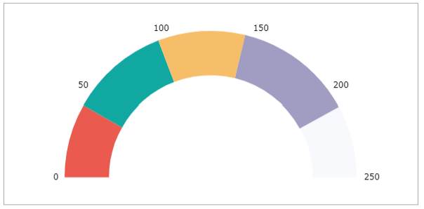
Gauge Chart
Also known as a speedometer chart or a dial chart, a gauge chart is one of the most commonly used visual tools to represent progressive values. This chart type is often used in executive dashboard reports to show key business indicators. Gauge charts are useful for comparing values between a few variables.
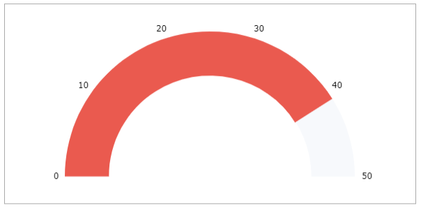
Modifying Chart Settings the value can be displayed using an arrow instead of the colored segment. Modifying the angle the segment can be sized.
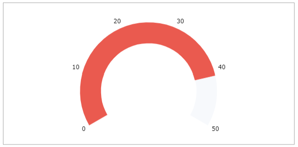
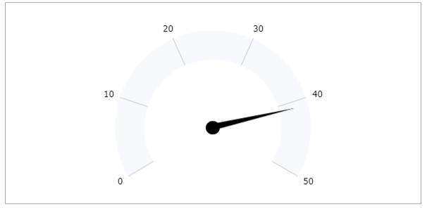
Modifying Chart Settings you can display the values stacked. Multiple data rows and/or categories can be used as a source for a gauge chart.
State Column Premium
State Charts visualize different states. Each state has a dedicated color. There are category state charts and state chart related to time. Here the category state chart is described. To display a state chart, create three columns of data consisting of the category, values, and colors like this:
| A | B | C | |
|---|---|---|---|
| 1 | A | 2 | Red |
| 2 | B | 3 | Green |
| 3 | C | 1 | Yellow |
| 4 | D | 4 | Red |
| 5 | E | 2 | Red |
The resulting state category chart below now shows a state for each category represented by a color.

To use the information the values provide, uncheck the "100%" checkbox in the Chart Settings.

The height of the column now represents the value. Using ";" in the color column, you can add line color and a specified data label text. To see the text, activate the data label and the "state" checkbox in the series settings.
Stock Chart Premium
The “Stock Chart” is a style of financial chart used to describe the price movements and ranges of a security, derivative, or currency. Each category typically shows one day, thus a one-month chart may show the 20 trading days as 20 candlesticks. Stock charts can also be built using intervals shorter or longer than one day.
Being densely packed with information, it tends to represent trading patterns over short periods, often a few days or a few trading sessions. Depending on the selected version of the stock chart one either needs three, four, or five data series.
High Low Close
Following the source data for a High Low Close chart. It needs three values for each category.
| A | B | C | D | |
|---|---|---|---|---|
| 1 | High | Low | Close | |
| 2 | Share1 | 25 | 19 | 19 |
| 3 | Share2 | 45 | 34 | 37 |
| 4 | Share3 | 35 | 18 | 28 |
| 5 | Share4 | 19 | 12 | 14 |
| 6 | Share5 | 43 | 25 | 31 |
The vertical line represents the range between the high and the low value. The small bar visualizes the close value.

Open High Low Close
Following the source data for an Open High Low Close chart.
| A | B | C | D | E | |
|---|---|---|---|---|---|
| 1 | Open | High | Low | Close | |
| 2 | Share1 | 20 | 25 | 19 | 19 |
| 3 | Share2 | 34 | 45 | 34 | 37 |
| 4 | Share3 | 21 | 35 | 19 | 28 |
| 5 | Share4 | 17 | 19 | 12 | 14 |
| 6 | Share5 | 27 | 43 | 25 | 31 |
The vertical line represents the range between the high and the low value. The bar visualizes the difference between the Open and the Close value. If the Close value is higher than the open value, the bar is colored white, other black. This way you can easily identity wins and losses.

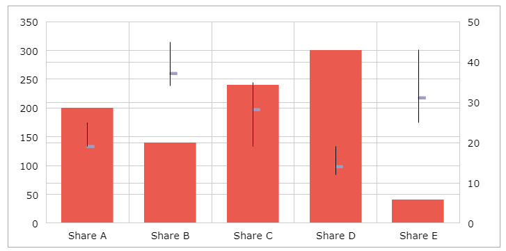
Volume High Low Close
Following the source data for a Volume High Low Close chart.
| A | B | C | D | E | |
|---|---|---|---|---|---|
| 1 | Volume | High | Low | Close | |
| 2 | Share1 | 200 | 25 | 19 | 19 |
| 3 | Share2 | 140 | 45 | 34 | 37 |
| 4 | Share3 | 240 | 35 | 19 | 28 |
| 5 | Share4 | 300 | 19 | 12 | 14 |
| 6 | Share5 | 40 | 43 | 25 | 31 |
The column bar shows e.g. the volume of traded shares. This datarow is scaled to the primary axis left of the plot. The vertical line represents the range between the high and the low value. The small bar visualizes the close value. These values are scaled to a secondary axis on the right.
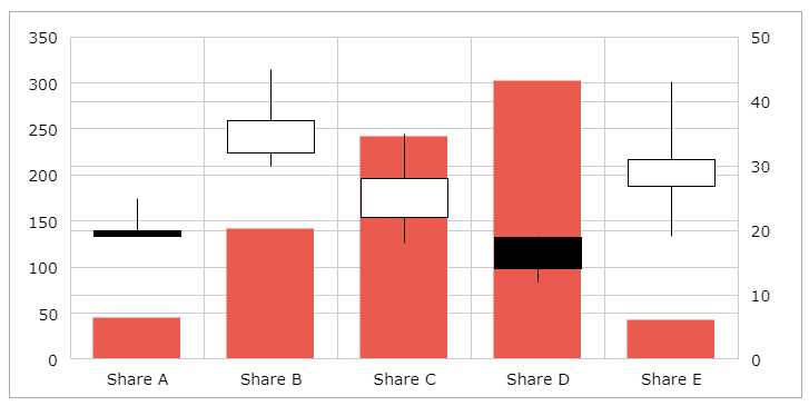
Volume Open High Low Close
Following the source data for a Volume Open High Low Close chart.
| A | B | C | D | E | F | |
|---|---|---|---|---|---|---|
| 1 | Volume | Open | High | Low | Close | |
| 2 | Share1 | 43 | 20 | 25 | 19 | 19 |
| 3 | Share2 | 140 | 32 | 45 | 30 | 37 |
| 4 | Share3 | 240 | 22 | 35 | 18 | 28 |
| 5 | Share4 | 300 | 19 | 19 | 12 | 14 |
| 6 | Share5 | 40 | 27 | 43 | 19 | 31 |
The column bar shows e.g. the volume of traded shares. This datarow is scaled to the primary axis left of the plot. The vertical line represents the range between the high and the low value. The bar visualizes the difference between the Open and the Close value. If the Close value is higher than the open value, the bar is colored white, other black. This way you can easily identity wins and losses. These values are scaled to a secondary axis on the right.
Funnel Chart Premium
Funnel charts are a type of chart, often used to represent stages in a sales process and show the amount of potential revenue for each stage. A funnel chart displays values as progressively decreasing proportions amounting to 100 percent in total. Here we are using the following values. Only one datarow can be display in a funnel chart.
| A | B | |
|---|---|---|
| 1 | Filter 1 | 90 |
| 2 | Filter 2 | 60 |
| 3 | Filter 3 | 48 |
| 4 | Filter 4 | 25 |
| 5 | Filter 5 | 12 |
You can have vertical or horizontal funnel charts.
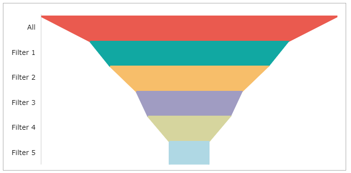
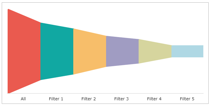
Modifying Chart Settings you can have bars or columns instead of trapezoid visuals.


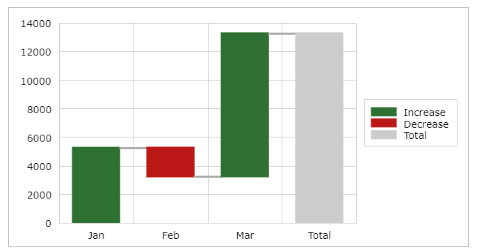
Waterfall Chart Premium
The Waterfall Chart displays processes and their changes over set categories looking for increases, and decreases, with the possibility of adding the sum. The sum column has to be marked as such using the Series Settings. For the sample below, the following values are used.
| A | B | |
|---|---|---|
| 1 | Jan | 5234 |
| 2 | Feb | -2000 |
| 3 | Mar | 10000 |
| 4 | Total | 13324 |
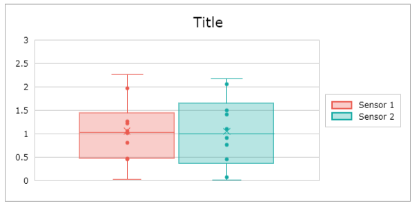
Boxplot Chart Premium
The Boxplot Chart can be used to graphically visualize the median, minimum, maximum, and quartiles of a data set. It uses a box and lines to visualize the distributions of one or more groups of related values. The Box show the range of the central 50% of the data, with a central line marking the median value. Lines extend from each box to show the range of the remaining data. Small circles show the values.
The following data set is used for the sample below:
| A | B | |
|---|---|---|
| 1 | Sensor 1 | Sensor 2 |
| 2 | 0.46 | 0.08 |
| 3 | 0.48 | 1.51 |
| 4 | 2.27 | 2.18 |
| 5 | 1.02 | 1.42 |
| 6 | 0.82 | 1.11 |
| 7 | 1.23 | 0.46 |
| 8 | 1.27 | 2.06 |
| 9 | 1.06 | 0.02 |
| 10 | 1.97 | 0.77 |
| 11 | 0.03 | 0.91 |