XY charts
A XY chart represents creates a chart with two linear axes. So for each datapoint you have to provide a value for the horizontal and one for the vertical axis. If the X Values are given as strings, the values will count from 0 to the number of values, just like a category chart does. But in contrast to a category chart given number values will be scaled to a linear or logarithmic scale. In addtion time scales are available. These will scale the value using a time value, that is deducted from the date (serial number) Below you will find a description of the available XY charts and the settings to modify the general appearance of a chart type.
Scatter Chart
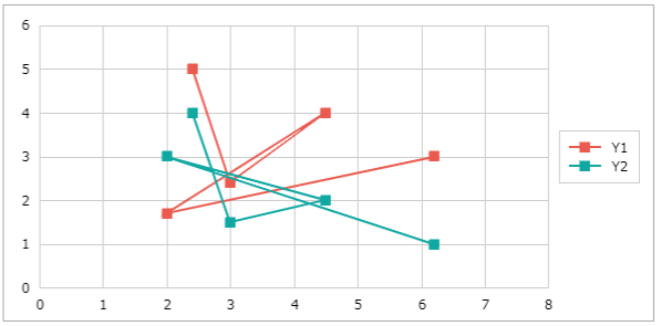
The scatter Chart shows the relationship of data sets. So a given set of x/y values is scaled on two value based axes. In many cases, the horizontal axis is used for time series data, to show accurate time/value relations to display a history of developing values.
The following data table is used for the samples.
| A | B | C | D | |
|---|---|---|---|---|
| 1 | X | Y1 | Y2 | |
| 2 | Measure 1 | 2.4 | 5 | 4 |
| 3 | Measure 2 | 3 | 2.4 | 1.5 |
| 4 | Measure 3 | 4.5 | 4 | 2 |
| 5 | Measure 4 | 2 | 1.7 | 3 |
| 6 | Measure 5 | 6.2 | 3 | 1 |
In the left diagram, the series line oolor is set to 'None'.

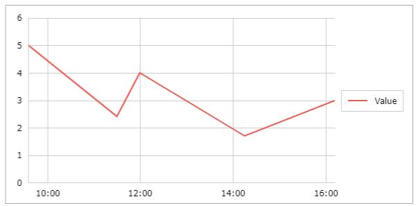
Following a sample where date value are used. The X-Axis is a time axis. This can be defined in the Axis Settings. The following data table is used for the sample.
| A | B | C | |
|---|---|---|---|
| 1 | Time | Value | |
| 2 | Measure 1 | 09:35 | 5 |
| 3 | Measure 2 | 11:30 | 2.4 |
| 4 | Measure 3 | 12:00 | 4 |
| 5 | Measure 4 | 14:15 | 1.7 |
| 6 | Measure 5 | 16:12 | 3 |
Bubble Chart
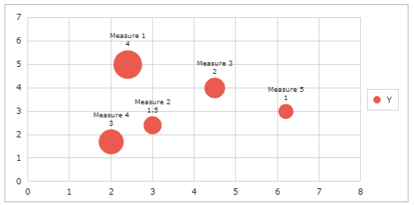
A bubble chart uses three values to visualize data points. The first two are used to scale the data points on the vertical and horizontal axis. The third value is used to size the diameter of a circle used to visualize the data point.
The following data table is used for the samples.
| A | B | C | D | |
|---|---|---|---|---|
| 1 | X | Y | Radius | |
| 2 | Measure 1 | 2.4 | 5 | 4 |
| 3 | Measure 2 | 3 | 2.4 | 1.5 |
| 4 | Measure 3 | 4.5 | 4 | 2 |
| 5 | Measure 4 | 2 | 1.7 | 3 |
| 6 | Measure 5 | 6.2 | 3 | 1 |
Here data labels are shown to easily identify the circle showing a data point. Data labels can be defined within the Series Settings.
Heat Map Premium
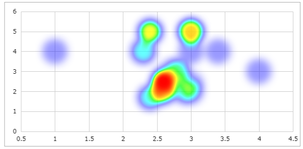
The Heatmap Chart visualizes and accumulates the intensity of points within areas of a XY Chart. The closer the values are grouped the hotter (using a more intense color) that chart area gets.
The following data table is used for the samples.
| A | B | C | D | |
|---|---|---|---|---|
| 1 | X | Y | Heat | |
| 2 | Measure 1 | 2.4 | 5 | 4 |
| 3 | Measure 2 | 3 | 2.4 | 1.5 |
| 4 | Measure 3 | 3.4 | 4 | 2 |
| 5 | Measure 4 | 2.4 | 1.7 | 3 |
| 6 | Measure 5 | 2.7 | 3 | 1 |
| 7 | Measure 6 | 2.8 | 3 | 3 |
| 8 | Measure 7 | 3 | 5 | 3 |
| 9 | Measure 8 | 1 | 4 | 2 |
| 10 | Measure 9 | 2.9 | 2 | 2 |
| 11 | Measure 10 | 4 | 3 | 2 |
| 12 | Measure 11 | 3 | 5 | 3 |
| 13 | Measure 12 | 2.6 | 2 | 4 |
| 14 | Measure 13 | 2.6 | 2.5 | 5 |
| 15 | Measure 14 | 2.3 | 4 | 3 |
| 16 | Measure 15 | 3 | 4 | 2 |
| 17 | Measure 16 | 3 | 2 | 2 |
XY State Charts Premium
“State Charts” visualize different states. Each state has a dedicated color. To display a state chart, create three columns of data consisting of the X-axis value, a Y value, and a color to show the state. As a state chart usually visualizes a state within a certain time period, the X-Axis Values should be serial date values and the X-Axis is using a time axis. By default the state chart is defined as a '100%' chart. To use the information the values provide, uncheck the "100%" checkbox in Chart Settings. The size of the column now represents the value. Using ";" in the color column, you can add line color and a specified data label text. To see the text, activate the data label and the "state" checkbox in the Series Settings
The following data table is used:
| A | B | C | D | |
|---|---|---|---|---|
| 1 | Time | Value | State | |
| 2 | Measure 1 | 12:00 | 1 | red |
| 3 | Measure 2 | 12:10 | 6 | green |
| 4 | Measure 3 | 12:23 | 4 | green |
| 5 | Measure 4 | 12:30 | 1.7 | yellow |
| 6 | Measure 5 | 12:40 | 3 | green |
| 7 | Measure 6 | 12:45 | 1 | red |
State Chart Time Premium
This chart type indicates states at certain time point by drawing a small vertical bar at the given time using the given color. This way you can indicate events using a color at a defined date.


State Chart Period Premium
Indicate states for a period. The bar is drawn from the initial time given to the next time given in the next data row using the given color. This way the period receives the color until the state changes.
