Chart Settings
The different charts have a large number of settings to alter and format charts. To structure the content, it is divided into two tabs (Diagram & General). While the "Chart" tab focuses on the details and content of the chart, the “General” tab gathers options concerning the shape, general appearance and events. The general settings are explained in the Shapes Section Configurations do not have to be static. As in a cell, it is possible to use cell references instead of static content. Not all settings are available for all chart types.
Data source
Defines the data source of your chart and its data rows. When you create a chart and selected a cell range before, the data source is assigned and the data rows are created and assigned to cell ranges as it usually makes sense for the chart type. Sometimes though it is needed to modify the automatic assignment. This is e.g. the case, if the source range has to be extended or reduced. There are two different approaches for this.
Coherent Data Rows
If "Data Range coherent" is checked the data source is automatically assigned as preconfigured by Streamsheets. Here you can define if the data is arranged in rows or in column. If it is arranged in rows, the values for one data row are expected in a vertical range, other in a horizontal range. If you change the source data range in general, the data rows are recreated based on the new source range. When creating the chart from a source range, Streamsheet tries to detect, if the first column or row contains labels. This depends on the content of the cells. If there are cells containing text, it is assumed, that there are labels. If the assumption does not fit for your charts, you can change the options here. | 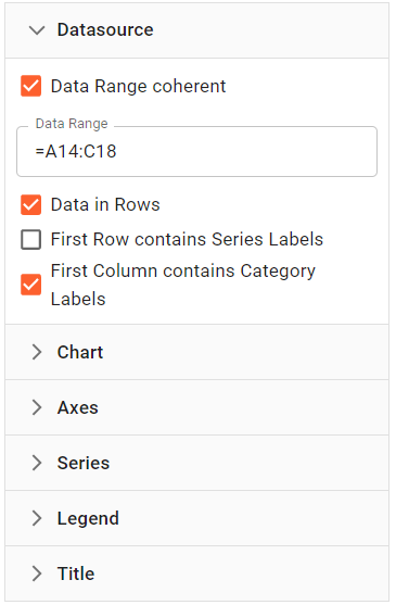 |
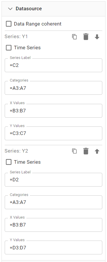
Not Coherent Data Rows
If "Data Range coherent" is not checked, you can assign the source range to each data row individually.
The options available then partially depend on the chart type. Here we see the options for a XY chart type. First you can select, if the data row contains a time series. This will be explained later. Below you have the option to define a cell range for all the needed data items for a data row individually:
|  |
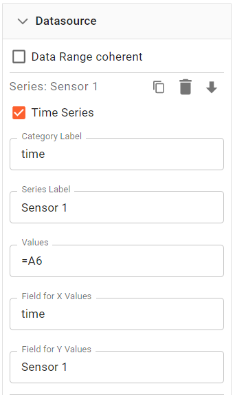
Now, if the "Time Series" box is checked, a different setup is expected. This setting only makes sense, if the source data is defined by a TIMEQUERY, TIMEAGGREGATE or TIMESCALE.SELECT function that accumulates data in the cell, where the function is defined.
Then the fields have the following meaning:
|  |
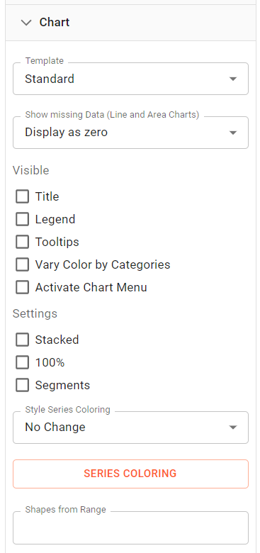
Chart
Focuses on the appearance of general aspects of the displayed chart.
Settings
The settings start with two dropdown menus. The first allows to quickly toggle between chart templates. The second focuses on the chart interpretation of data. If there are x values with a missing y parameter, then this menu offers different choices for this scenario. Several checkboxes enable or trigger the following chart features. These options vary by the chart type. In the "Visible" section:
And in the "Settings" section:
|  |
Series Coloring
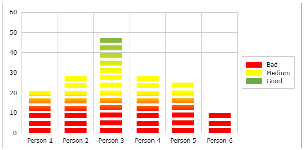
For some charts, you can define ranges, where the fill color of a data series point automatically changes based on the set ranges. This is valid for bar, column and gauge charts. If you select "Color Change" from the selection, the color of the e.g. column will adapt to the range defined in the "Series Coloring". If you define the "Series Coloring" like in the following example:
A chart setup like below will color the bars according to the values and their fit within the series coloring ranges. Observe how Person 1 with a value of 23 becomes yellow as the value lies in that range of the series coloring definition:
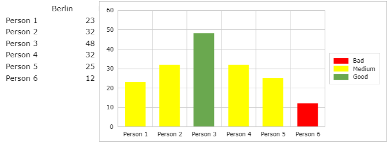
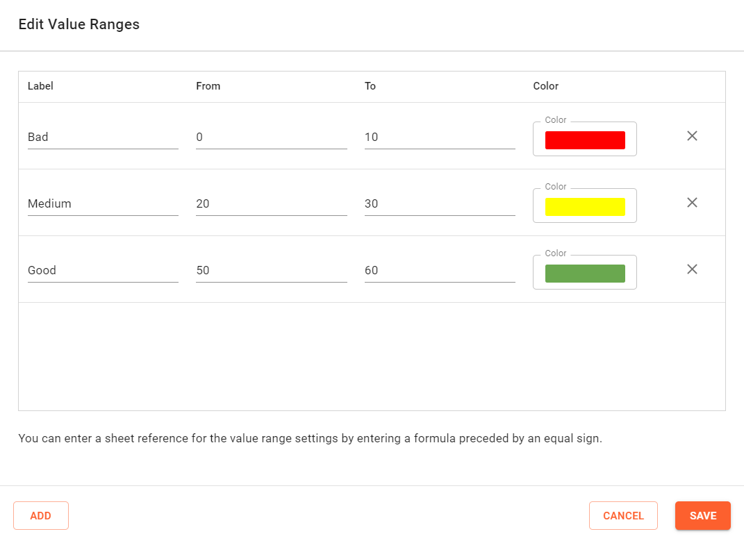
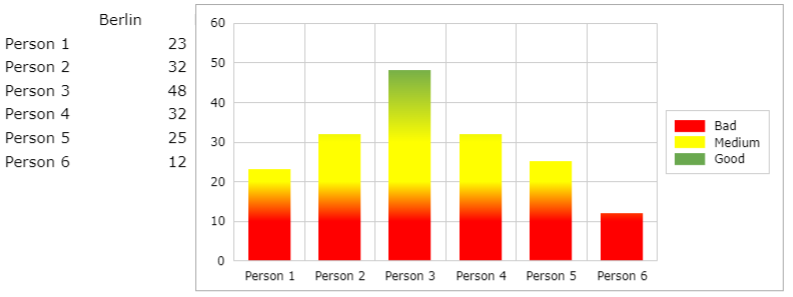
The legend then shows the ranges using the label within the series coloring definition. A different effect is created if the series coloring is set to "Gradient". Then each bar value range is colored using the ranges. If there is a gap in the definition of the "Series Coloring" a gradient is drawn to fill the gap as shown below.
Using the segments flag, the following chart layout is available:
Shapes from Range
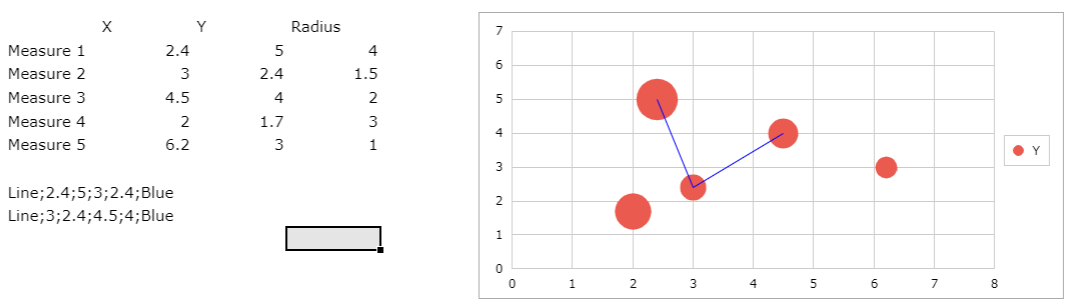
The "Shapes from Range" allow you to enter a cell range to specify additional shapes on the chart. These items are drawn with the plot area of the chart. The coordinates of them are scaled against the axes. This way you can add custom items on the chart to visualize additional information or hints. For category charts the x-coordinate start at 0 and increments by one for each category. The cell defining a shape must follow the following text representation. In general it is a string with definitions for the shape parameters divided by semicolons. The first parameter defines the type. A sample would be "Line;1;10;2;20;red" defining the type, the coordinates and the color of the line.
The following types are available:
"Line" with the following parameters
- X1 : X coordinate for the beginning of the line
- Y1 : Y coordinate for the beginning of the line
- X2 : X coordinate for the end of the line
- Y2 : Y coordinate for the end of the line
- LineColor : A valid color name of hex color value
"Circle" with the following parameters
- X : X coordinate for the center of the circle
- Y : Y coordinate for the center of the circle
- Radius : Circle radius in 1/100mm
- LineColor : A valid color name of hex color value
- FillColor : A valid color name of hex color value
"Rect" with the following parameters
- X : X coordinate for the left or center
- Y : Y coordinate for the top or center
- Width : width in 1/100mm
- Height : height in 1/100mm
- LineColor : A valid color name of hex color value
- FillColor : A valid color name of hex color value
- Center : If this flag is set to 1, the coordinates define the center of the rectangle instead of the top left position
"Text" with the following parameters
- X : X coordinate for the center
- Y : Y coordinate for the center
- Text : Text to display
- FontName : A valid font name
- FontSize : Font size in points
- FontColor : A valid color name of hex color value
- HAlign : Horizontal alignment. 0 for left, 1 for center and 2 for right alignment. Default is 1.
- VAlign : Vertical alignment. Use "top", "middle" or "bottom". Default is "middle".
A vertical range with at least one row and one column is expected. Below a bubble chart connecting three bubbles using two custom lines. Observe that the coordinates are given in scale units.
Axes
Settings
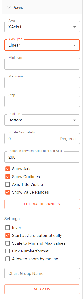
At the top of the axes settings, you can select, which axis to modify. You can have more than one x or y axis. At the bottom of the settings you can add a new axis. For each axis you can define the type of axis. There are "Category", "Linear", "Logarithmic" and "Time" variations available. "Category" only for category charts. Then the ranges and steps can be defined depending on the type of axis
If there is no entry in those fields, the values are automatically calculated from the data, that the chart references. You can enter a cell reference to retrieve those values from the sheet. This allows a dynamic Minimum or Maximum. Below you can define the position of the axis. Depending on the orientation of the axis, you can position the axis to the left or right and top or bottom. If you have more than one axis on one side, they will be painted next to each other. You can rotate labels between 0 and 90 degrees, if labels interfere and define the space between the axis line and the axis value strings. Below that you can control which items of the axis are visible:
Below some additional settings are available. Some of these settings are not available for all chart types.
|  |
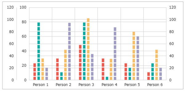
The button at the bottom allows you to add an additional axis to your chart. The axis will be added to same axis orientation. Below a sample with three axis. Two to the left and one to the right. Usually you would assign at least one series to all of the axes. This is done in Series settings below.
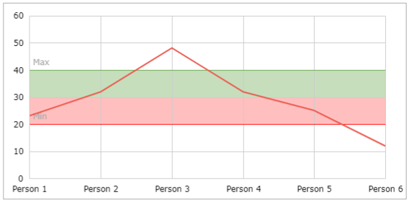
Axis Value Ranges
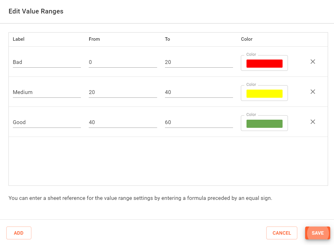
You can define an axis value range to visualize a range of valid or desired values. The range is drawn behind the data rows. It can contain one or more value ranges. If you click on the Edit Value Ranges Button, the following dialog will appear (here we already filled in some ranges):
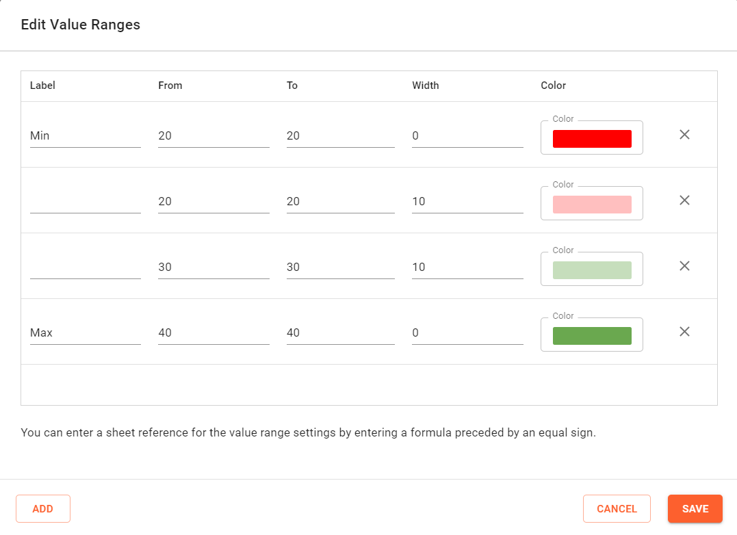
Use the add button to create a value ranges. Each range has the following attributes:
- Label, which will be displayed to the left of the value range
- From and To, to define bottom line defining the value range. The from value scales at the beginning of the axis and the To value at the end of the axis.
- Width, to define the width or height of the value range. So a value range that has a bottom line at scale values 20 and 20 with width of 20 will draw up to a value of 40. If the width is 0 only a line is drawn.
- The Color define the fill or line color of the value range.
Series
In the series menu, it is possible to select a series or a data point of a series and change the settings of the series or point. Not all settings for the series are available for all chart types.
To change the color appearance of the entire series, select the series by clicking on it and using the toolbar to set lines and fill colors for the lines, bars, columns bubbles and so on. Also font settings are changed by selecting the item within the chart and changing the font settings using the main toolbar.
Settings specific to maps are explained in the Maps Section.
Select the series to change at the top selection box. Below you can select a data point, if desired. This way you can individually change the setting for on data point to e.g. change a marker or a data label only for this point. Select 'All' to change the series settings. If a line, column or area chart is set, you can change the display type for a series. This way you can create a combination chart showing one series as a line and another as a column. For line and scatter charts you can define the look of the marker to use. Choose from a variety of markers and set the desired size, fill and line color for the marker. For gauge charts you can define, if the value within the gauge is display using a color segment or a pointer. The pointer can have different type like arrow, line and narrowing line. You can also define where the end of the pointer is positioned. Then some settings are available depending on chart type.
If Data labels are visible, the following options are available. Some of them depend on the chart type:
The "Tooltip Content" defines the options to display within a tooltip, when you hover over a data point. You need to enable tooltips in the chart settings to activate that behavior. | 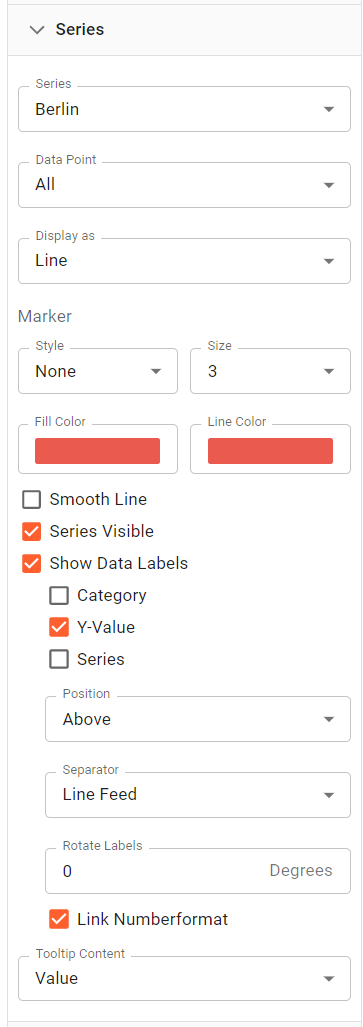 |
Legend
The legend can have an additional title. This will be placed on top of the legend items.
The position of the legend is defined by the "Position" options below. The default settings is middle right. You can hide or show the legend using the "Visible" checkbox. | 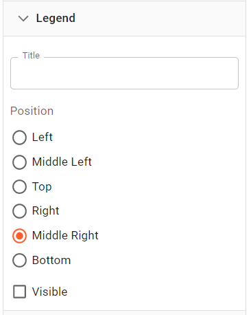 |

Title
The chart title is provided in the top field. The position of the title is defined by the "Position" options below. The default settings is center. The title is always displayed on top of the chart. You can hide or show the title using the "Visible" checkbox. |  |