Maps
Introduction
Maps can be used to display value based geographical information. Streamsheets supports using maps to color regions depending on values. You can also display markers on locations and size them. Another option is to display charts on top of regions or locations.
By using multiple data rows, you can create different layers for a map. This enables you e.g. to color a region based on values an show another value information by display a chart on top of the region.
Creating a map chart
There are two approaches to initially create a map chart. If you already have regions names on your chart that potentially map to map regions, you can select those regions and accompanying values to create a map chart like you would do it with a normal business chart.
A map chart mostly equals a business chart. Most of the settings are available that you would expect from a business chart like title, legend and series definitions. In a map chart each series is visualized as a layer on the map. The region names are the categories.
So if you have those regions, select them and create a map chart by selecting it from the chart type. The chart generator tries to identify the map by comparing the source map regions with regions within the set of regions of all maps. If that was successful, the map is selected and displayed.
Another approach is to just mark a cell or range which is supposed to be the data source for the map and create a map chart. Then a world map is displayed. If you now double-click on the regions the Series Settings are opened. Here look at the following settings:
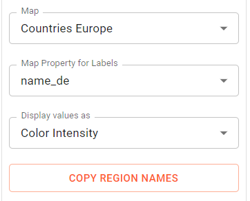
Here you can select the map to be used for the series. If you want to use another map select it in the map selection. Now, if you want the names of the region and you do not have them on the sheet already, use the "Copy Regions Names" button. This will copy the names to the clipboard. Now you can paste them on the sheet by selecting the target cell range and pushing Ctrl-V.
To create a result like below, follow these steps:
- Select Map from the chart types
- Create the map on the sheet using the mouse in the region indicated below
- Double-click on the regions
- Select Countries Europe from the Maps selection
- Click on "Copy Region Names"
- Select cell A5 on the sheet
- Push Ctrl-V on the keyboard
- Then enter some values for the regions to color them
- Now verify that the data source covers the regions and values.
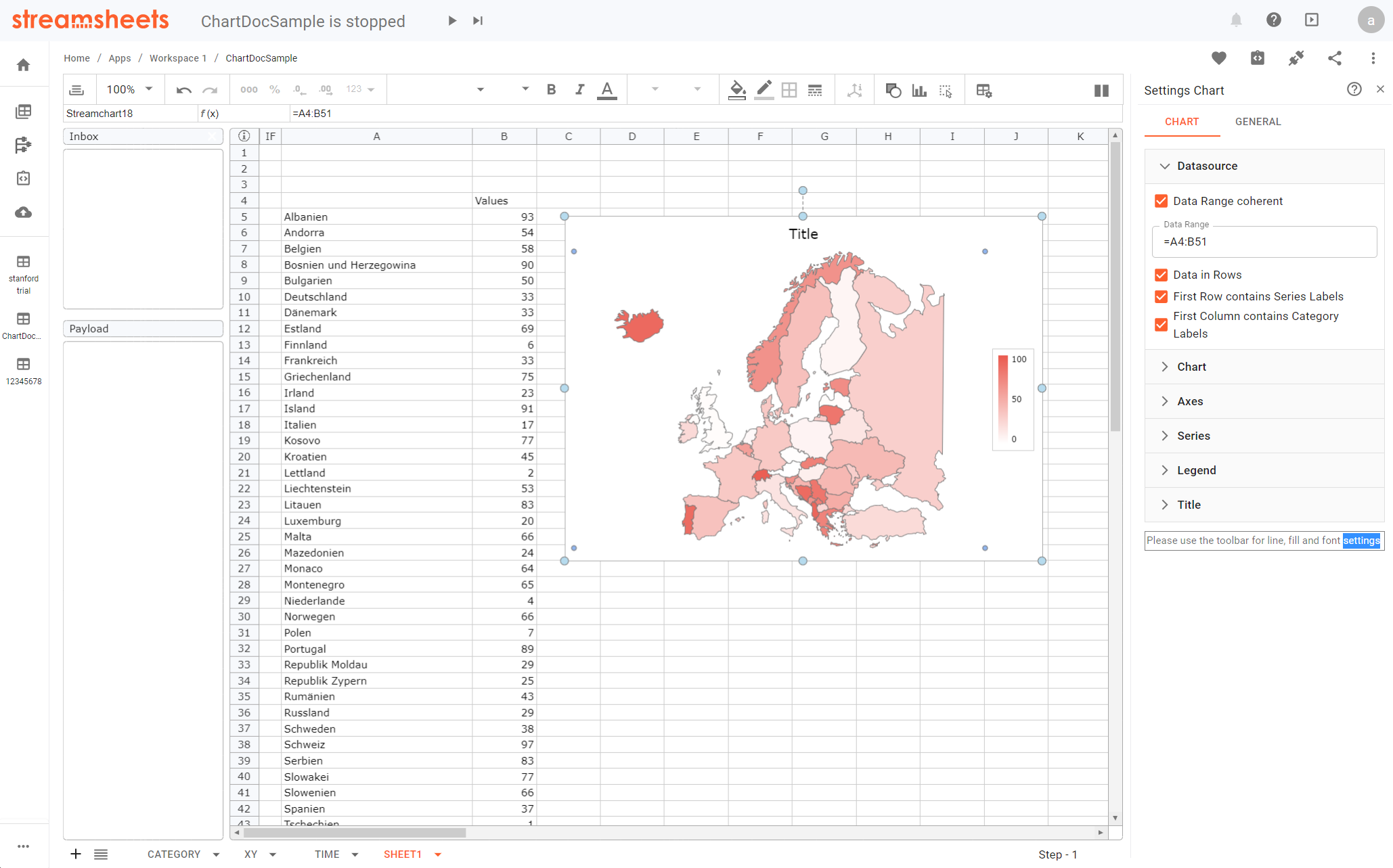
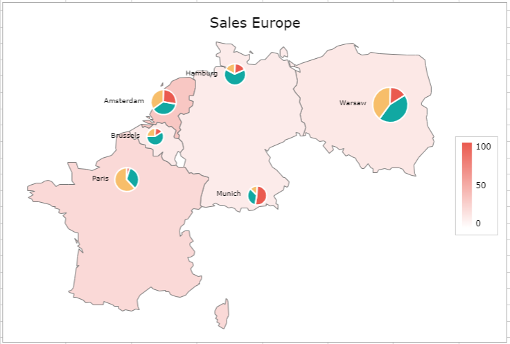
Map chart with two layers
Creating a map using two layers involves more work. In contrast to business charts, the two data rows necessary to create a two layer chart are not automatically created. As the category content of these data rows differ, you have to create the second data rows manually and then assign data source appropriately.
First we will use one data row two visualize sales per country. In addition, only a subset of countries only provides data and should be displayed. Second another data source is used to show sales volume by product assigned to a sales organisation within a country. This will be display by a pie chart on top of the location.
The result should look like below:
The following steps are necessary to obtain the result:
- Enter data like in the screenshot
- Select A2:B7 and create a map chart.
- Select the data series and choose "Countries Europe" as the map
- Select "Chart Settings" and select "Do not display" from the "Show Missing Data" options.
- Select the title and assign cell "B2" to the title by entering it in the edit bar
Now the first layer is available, showing the sales by country for selected countries.
Now select the map plot region to modify the data source settings.
- Deselect "Data Range coherent"
- Duplicate the series by clicking on the copy button right next to the series name "Sales Europe"
- Assign "=D3:D8" to the categories and "=E3:G8" to the values.
- Now the secomd data series retrieves the necessary values for the charts.
- Select the series section and select the second data row.
- Assign "Cities World" as the map.
- Select "Charts" and "Radius" from the "Display values as" selection and deselect "Color Intensity".
- Select "9" from the "Marker Size" selection.
- Check the "Show Data Labels" checkbox and select "Left" from the "Position" select.
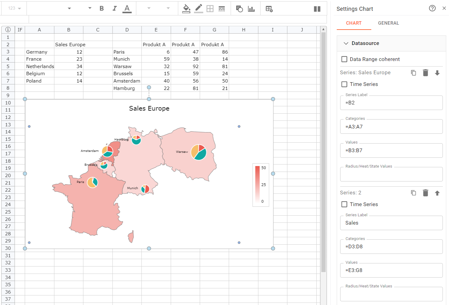
Now the chart should look as follows:
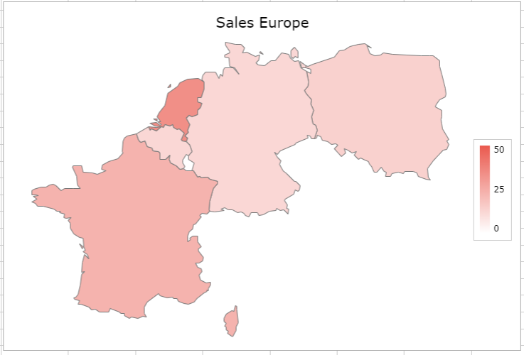
Almost done, but the region coloring now scales using the values from all data rows. This is the default setting and makes sense for most business chart, but here we want only the first data series to be used for the scaling. The scaling is based on axes. Axes scale by collecting all values from all data series that are assigned to the axis. Here we need the first series to uses one axis scaling and the second to use another. So we need to have one axis assigned to the first series. The second series should use another axis. Then automatically the first axis will only use the first series. To achieve this:
- Select the axis section
- Select "YAxis1" from the "Axes" select
- Click on "Add Axis" at the bottom. Now a second Y Axis has been created, named "YAxis2"
- Select the "Series" section and select the second data series.
- Assign "YAxis2" in the "Axis Assignment" section.
Now the result should look like the initial target screenshot.
Series Settings for Maps
Selecting a series within a map, the following additional settings are available:
Maps
We provide a generic set of maps, you can choose from. Select the one, you need and it will be used for the series.
The maps used in Streamsheets use the "geojson" format. These can be generated manually, but preferably can be exported from existing open source maps. Customizing the map set is possible, but not part of this documentation. Contact our professional services for more information on this subject.
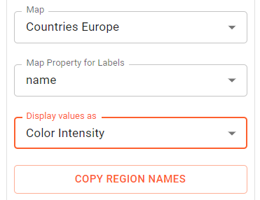
Map Property for Labels
The labels defined the category names. Each region within a map has set of properties. A property named 'name' must be present. This is the default property used for matching category names on the sheet to region names. If there are other properties available, these will be offered here. If you choose one of those, your category names on the sheet must match the region property content. This way, you could use e.g. a local name or a region code or shortcut instead of a region name.
Display values as
The following options can be activated here:
- Color Intensity: The region is colored proportionally to the maximum value of all values.
- Color: The region or marker is using the data value (color name of hex value) for coloring.
- Line Width: Assign a line width value (1/100th mm) to the line formatting of a region. This could make sense of you display rivers or streets and want to visualize values by changing the with of that category.
- Radius: Size a marker or chart based of the relation of the largest value and the value of that data point.
- Chart: Display business chart based on multiple values in the data source at the location of the region
Copy Regions Names
Clicking on that button, copies all region names to the clipboard and allow you to paste those into the sheet. It uses the current selected "Map Property for Labels" setting.
Chart Settings for Maps
Selecting the chart, the following additional settings are available:
Allow Map Zoom
In the charts section you can activate the "Allow Chart Zoom" feature. This will display "+/-" button in the top left corner of the map and allow you to zoom using these or by mouse wheel. In addition, you can move the chart offset using the mouse, if the chart is zoom.
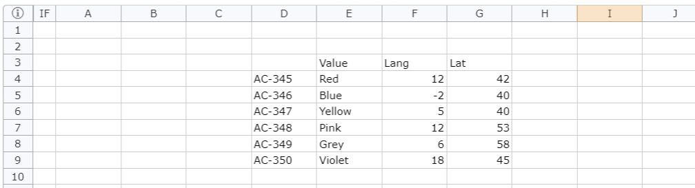
Map Layer from Spreadsheet Range
A map layer from the sheet allows you to create a custom layer using coordinates from a sheet range. You can either define a location or a line identified by a category, a value and coordinates. Let's make a sample.
- Enter the following data on a sheet range
- Create a map by selecting an empty range (e.g. A3:B8). This only serves as a background map. Therefore, no data is needed
- Assign the "Europe Countries" map to that series by selecting and double-clicking on the countries.
- In the Datasource section copy the first data series and assign the cell reference as follows:.
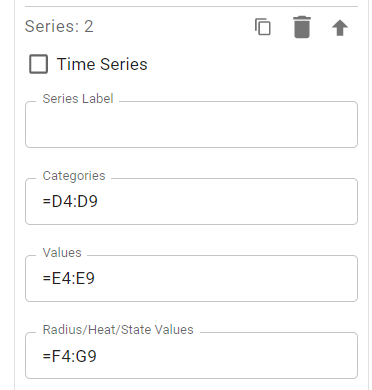
- Now select the second series in the series settings.
- Select "From Worksheet" in the "Map" select.
- Select "Color" from "Display values as".
- Select "Circle" from "Marker Style".
- Activate "Show Data Labels"
- Click on the data labels in the chart and assign a background color and border using the toolbar.
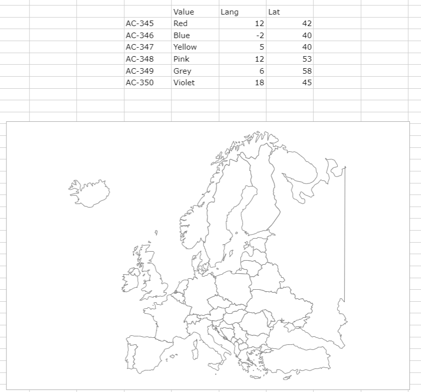
The result looks as follows:
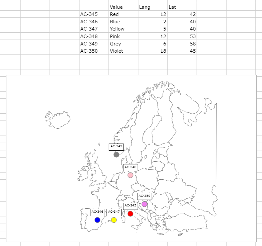
Now you can observe markers on top of the background map. The second layer now contains markers from the second data series. The name of the marker is in the first column of the cell range. The second column contains the color to use for coloring. This is activated by selecting "Color" from the "Display values as". The last two columns contain the coordinates of the markers. These coordinates are given in longitudes and latitudes.
The coordinates are identified, because of the "From Worksheet" option and the last setting of the data source to use the cells with the longitudes and latitudes.
This way you could dynamically display the current location of devices or resources on a map from incoming data.